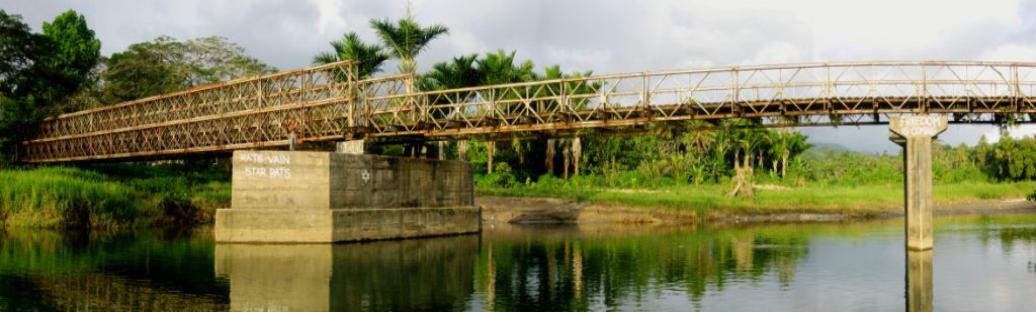
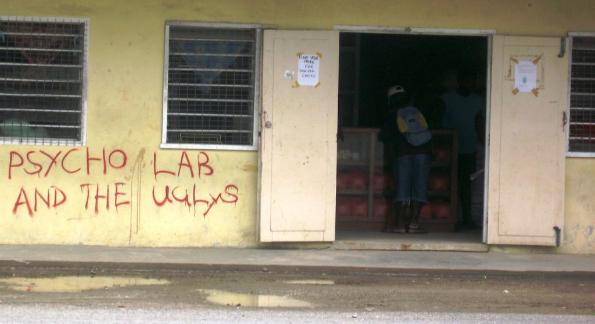
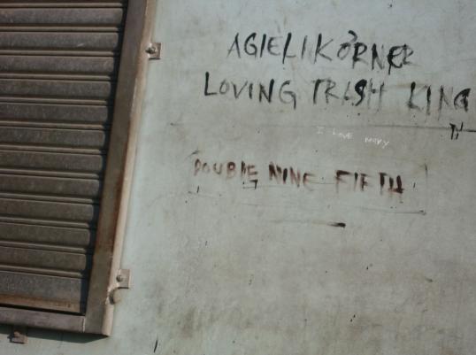
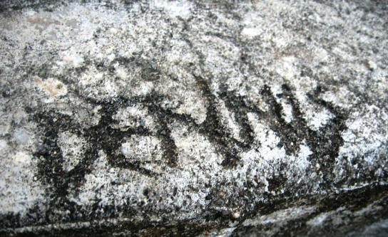
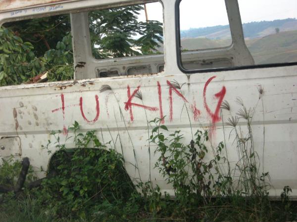
| Sean's Pick - score and comments Under the circumstances I think you really stuck your neck out, whether it made it easier seeing my ones first or not. I really appreciate your effort all the same and it shows in each of these images The Bridge – 4 Stitched images, contrast adjusted, cropped Suitably listed first this shot has to get it mate. I like the small splash of the subject with the obvious need to take two shots and the stitch. The words “Freedom” and what looks to be “Has come” really puts the bridge into perspective. I guess bridges do that and it suits. Good exposure taken at the right time of the day and the right amount of balance between structure and landscape. Mate cant really fault this shot and don’t think I should. Dennis – Cropped Yep again moving mediums on me and like it. You sort of get the idea the artist here realised how long the job was going to take and decided to reduce the size of the etch. Either that or he forgot the letter I?! Nicely taken and yep works well as a B&W with the conc. I Love Mary – Cropped, contrast adjusted I don’t know if we were taking shots of the extremes of graffiti but I am glad this artist got some coverage all the same. So who is Mary and is she really good enough to love? You probably should have seen the end result to avoid the crop – Perhaps you could have gone in close on the title and use the other text de focused? Loving Truck – Untouched My second choice if not equal second – can we do that? Use of your Fstop superb mate, tripod? What a great shot to own and one that sort of sums up the end place for this wreck. I will finish before I change my mind.. Psycho Lab – Cropped, contrast adjusted Not sure about the artist intent with the work but hey Psycho is hard of enough word to write at the best of times so well done! The use of the counter works well – just what the hell are they selling there? |
Sean's Submissions
Martin's Submissions
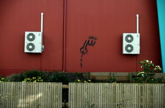
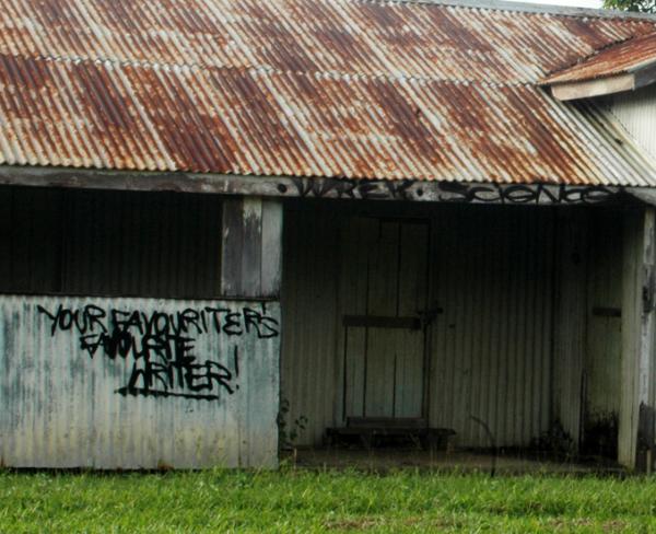
| Martin's Pick - score and comments Great shots all of em!! I can see you were all over it this month. "United" gets my nod however. I nearly gave it 10 for composition. Exposure and depth of field are spot on. My eyes are wandering all over the image and it feels goooood. Other Images: Condenser waste - I think a little crop on right and left would have given symmetry and improved it. Custom orbit - Great colour. Nice framing Favourite writer - I love the "Wrek Science" tag. Top notch exposure again. Half sphere - I nearly chose this one. What lens did you use? This shot would make for a great print. Paint Dis - Great colours. Would love to see the raw image. Power Piller - Nice capture of two different light subjects. Pest - Nice contrasts. Looks like a tripod shot? |
Overall with weighting 8.73 / 10
Overall with weighting 8.58 / 10
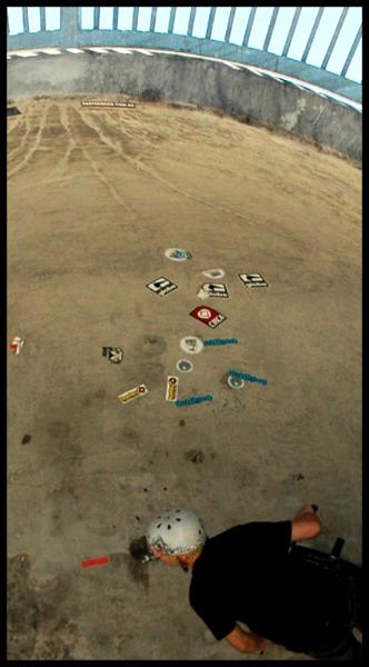
| Sean's photo notes Can you believe next month it is our One Year Anniversary with this Comp! duhhhh where did the year go? Ok image notes 1. Custom Orbit - brightness only change ( Farm house busker art) 2. Favourite writer - Cropped - levels adjusted ( Farm house busker art) 3. Half Sphere - Cropped - levels adjusted (Cairns esplanade skate park) 4. Paint Dis - brightness & Levels (Freshwater skate park) Power Pillar - Cropped, level & brightness adjustment - (Cairns pier) United - Brightness only - (Freshwater skate park) Condenser waste - Untouched - (Warehouse tatt) Pest - De saturated, brightness adjustment - (Freshwater skate park) |
| MAY 2009 Topic: Graffiti set by Martin |
| This work is by Sean Reason. It is licenced under a Creative Commons Licence |
| Martin's photo notes A bad month…….. No subject matter and no @#&*ing camera. 1. The Bridge – 4 Stitched images, contrast adjusted, cropped 2. Dennis – Cropped 3. I Love Mary – Cropped, contrast adjusted 4. Loving Truck – Untouched 5. Psycho Lab – Cropped, contrast adjusted All shots taken with Canon IXUS 900Ti. |
|
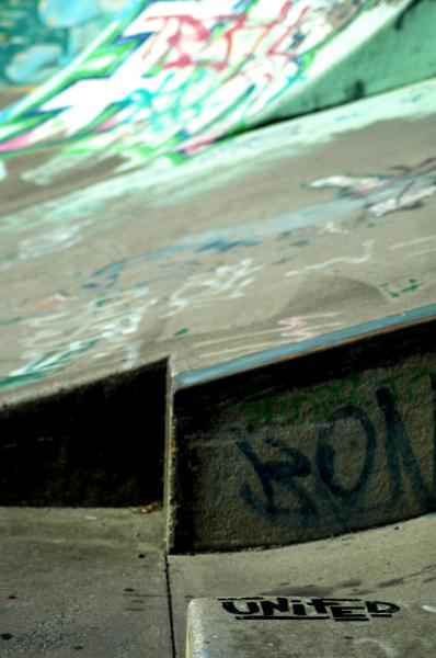
| "United" |
| "Power pillar" |
| "Half Sphere" |
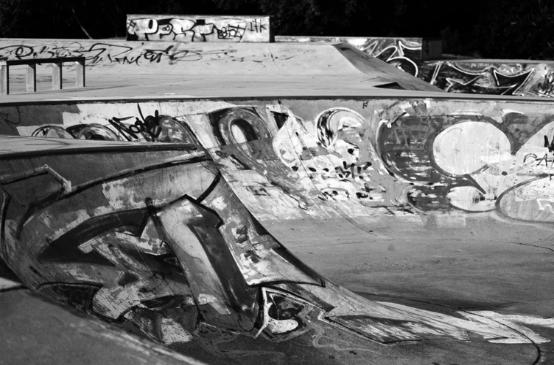
| "Condenser waste" |
| "Favourite Writer" |
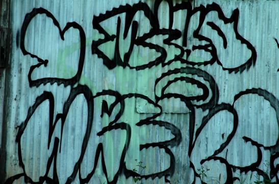
| "Custom Orbit" |
| "Pest" |
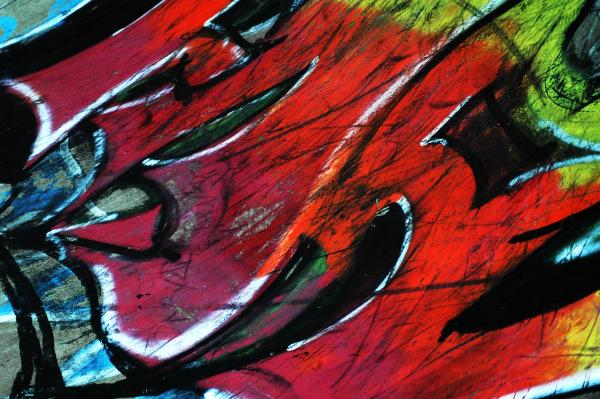
| "Paint Dis" |
| "Denis" |
| "Loving truck" |
| "The bridge" |
| "Psycho Lab" |
| "I love Mary" |
Overall with weighting 8.73 / 10
|
Next month "LANDSCAPES"