

| December 2011 Topic: "Monochrome" Now repeating photocomp topics from 5 years ago |
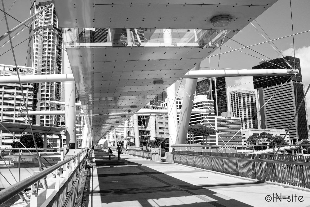
| "Stroll" |
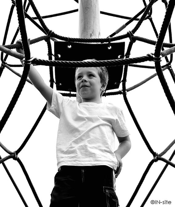
| "Web Climb" |
|
| NEXT MONTH: repeating photo comp subjects from 5 years ago! Subject "Free Range" |
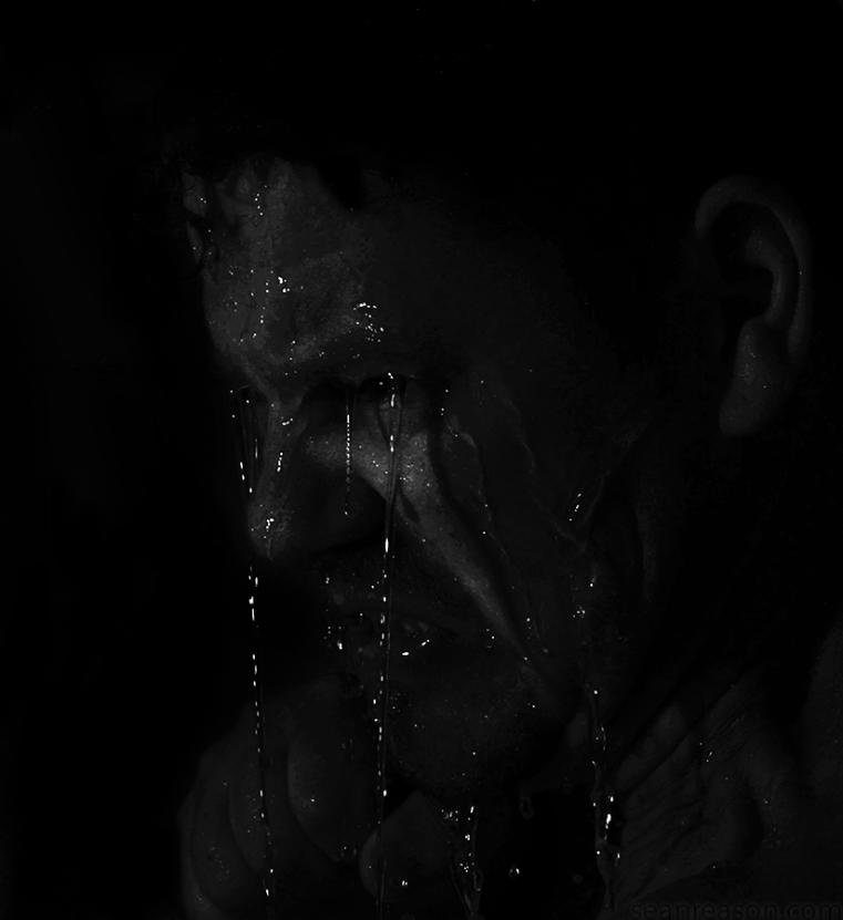
| "Fight Club" |
Overall with weighting 7.48/ 10
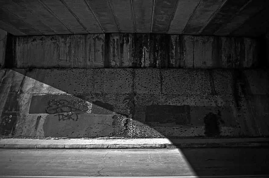
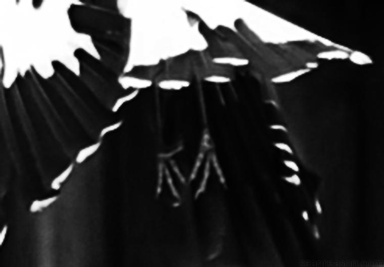
| "Takeoff" |
Sean's Pick - score and comments: "Stroll"
Ok Ok up and down the corridors of your submission and kept coming back to the image Stroll, before i read up on the
approach I was really impressed with the level of exposure, sharpness, composition, and DOF.
I am not sure if it is however more to do with the architectural nature and one point perspective that really got me in the
end which could have greatly swayed me?. Not surprised in the end to see the exposure was nailed with a good HDR
Other shots in order of my merit:
Waiting for some more bang in 2012!
Ok Ok up and down the corridors of your submission and kept coming back to the image Stroll, before i read up on the
approach I was really impressed with the level of exposure, sharpness, composition, and DOF.
I am not sure if it is however more to do with the architectural nature and one point perspective that really got me in the
end which could have greatly swayed me?. Not surprised in the end to see the exposure was nailed with a good HDR
Other shots in order of my merit:
- Web Climb: Love the symmetry to this image and the way you have got master Hutton inside the web. Great
exposure under difficult lighting conditions too but a little pissed the rope is through his forehead, nicely cropped
all the same.
- Life and Death: Good suitable name that sets the way this shot needs to be viewed, nice cropped pointing to
the heavens working with the lens distortion instead of correcting it.
- Gen Z: A shot that had potential but a bit to grainy and sharpened for my liking. Typical of the youth today
gorking into their mobiles with “the what you looking at” attitude to boot – perhaps a raised figure would have
worked wonders?
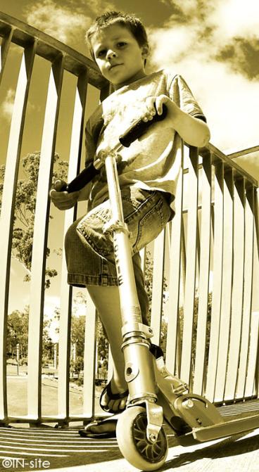
- Scooterman: Not a bad exposure, a little unbalanced for my liking. Not a big fan of the sepia with such a shot
- Platinum Blonde:, distracting little lights and loss of detail lets this shot down (had the model – work it)
- Leaf: Had to really find the leaf but then wondered why? Cross lighting ok, could be natural state of colour but
doest cry monochrome work for me..
Waiting for some more bang in 2012!
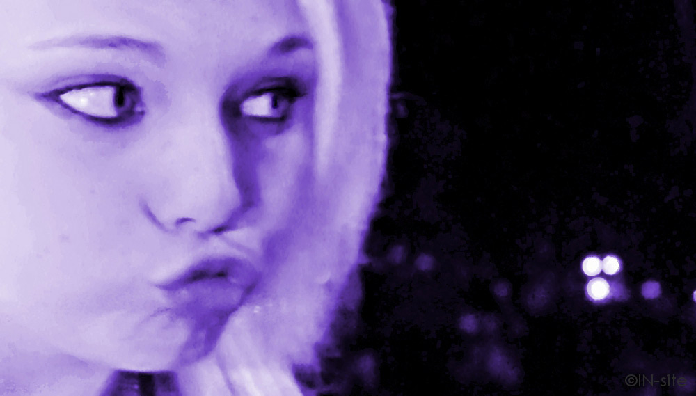
| "Gen Z" |
| "Platinum Blonde" |
| "D Roaded" |

Martin's photo notes:
OK Braaaaaaz, first again.
I had to toss most of my deliberate
Monochrome shots as I wasn't happy
with the level of detail I was chasing.
As such I then took an alternate tack
in poor lighting conditions which
would make colour shots suffer.
Fairly happy with my results, and I
hope you like my variety this month.
That frigging Thriller shoot has been
postponed until late Feb.....
Image notes - all de saturated.
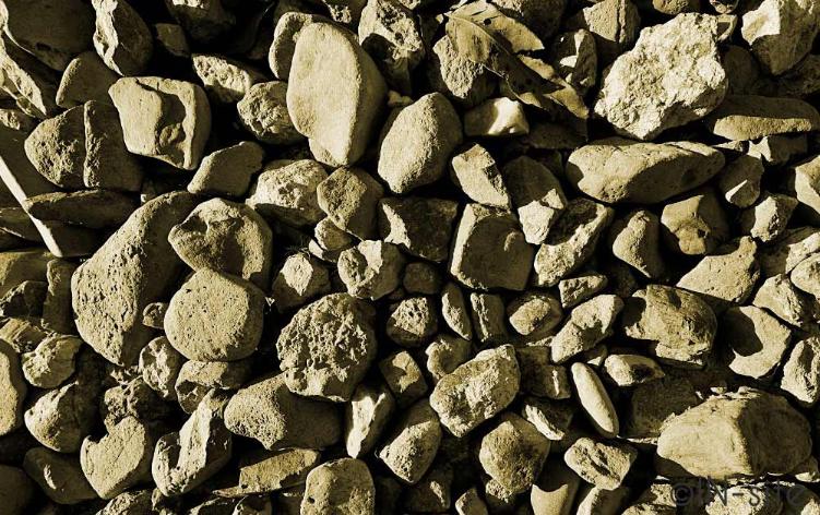
- Leaf - Cropped, curves,
coloured
- Webclimb - Cropped, curves,
sharpened
- Life and Death - Cropped,
contrast
- Scooterman - Cropped,
curves, coloured
- Gen Z - Cropped, flattened,
blurred, noise, heavily
sharpened
- Stroll - Cropped, HDR,
sharpened
- Platinum Blonde - Cropped,
threshold, blurred, coloured
_________________________________________________________________________________________________________
|
Overall with weighting 8.80/ 10
Martin's Pick - score and comments: "Pooled"
Another excellent little stack this month Braaaz. Variety outstanding.
Two shots immediately stood out for me, and after long and careful consideration my gut instinct remained
true. I have awarded first place this month to Pooled. I guess it is a standard fare HDR, but the tonal
range mixed with the silhouettes makes this a remarkable capture. I had to run a horizontal over it as I
thought my eyes were playing tricks, and I found that no grade escapes the Plumbers gaze. The pool tiling
was either laid by a drunk, or you may not have shot this at 90deg to the plane (perspective shift).
Anyways, I had to find a flaw in composition somewhere..... Or I could have banged on about the frigging
power cable.... BTW, what is the strip lighting(?) above the pool on left?
Other images in order of merit:
All in all very nice once more.
Another excellent little stack this month Braaaz. Variety outstanding.
Two shots immediately stood out for me, and after long and careful consideration my gut instinct remained
true. I have awarded first place this month to Pooled. I guess it is a standard fare HDR, but the tonal
range mixed with the silhouettes makes this a remarkable capture. I had to run a horizontal over it as I
thought my eyes were playing tricks, and I found that no grade escapes the Plumbers gaze. The pool tiling
was either laid by a drunk, or you may not have shot this at 90deg to the plane (perspective shift).
Anyways, I had to find a flaw in composition somewhere..... Or I could have banged on about the frigging
power cable.... BTW, what is the strip lighting(?) above the pool on left?
Other images in order of merit:
- Fight Club: Great setup and nice lighting. Really draws you in to the shot to find detail.
- Takeoff: I keep coming back to this shot hoping that it may grab me harder..... I like it, but I just
dunno.
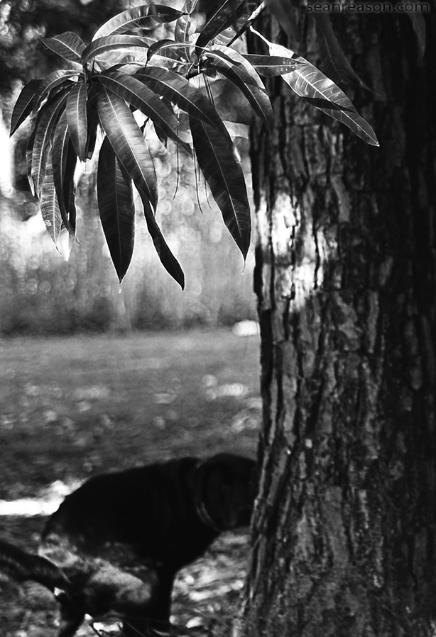
- Man go: Nothing like toilet humour I say. Great contrast and detail in the leaves. I hope you got a
model release??
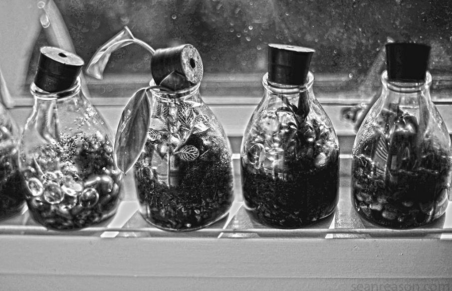
- Bottled Life: Nice product shot with plenty of detail, but maybe could have been set against a
different background.
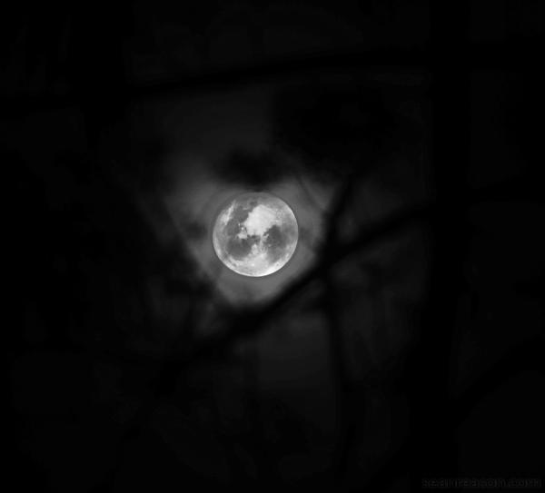
- Mooned: Not bad, but the moon slightly off centre annoys the crap out of me.
- D Roaded: Whats with the name? Nup does nudda for me.
All in all very nice once more.
Sean's photo notes:
Ok Rideyo Man!
Just logged on some 10 mins after
your submission to post mine so
lets call it subs at same time!
Had spread my shots out over the
first month which is something I will
try and do for variety reasons, I
also desat them in the same tone.
Image notes, - yes all destat
Ok Rideyo Man!
Just logged on some 10 mins after
your submission to post mine so
lets call it subs at same time!
Had spread my shots out over the
first month which is something I will
try and do for variety reasons, I
also desat them in the same tone.
Image notes, - yes all destat
- Man go, cropped, contrast
- D_Roaded, contrast, dodged
& sharpened
- Fight Club, cropped,
removed some white
reflections from head,
contrasted, sharpened
- Mooned, Cropped,
sharpened, dodged & burned
- Bottled life, Cropped,
sharpened, dodged & burned
- Pooled, Cropped, hdr
- Take off, cropped & sharped
contrast adjustment.
_________________________________________________________________________________________________________

| "Leaf" |


| "Pooled" |
___________________________________________________________________________________________________________
_________________________________________________________________________________________________________
| "Life & Death" |
| "Scooterman" |
| "Man-go" |
| "Mooned" |
| "Bottled-life" |