
Sean's Pick - score and comments: "BB"
Not Mate sorry for the delay on your eval – not for any reason but I have been a bit flat of late.
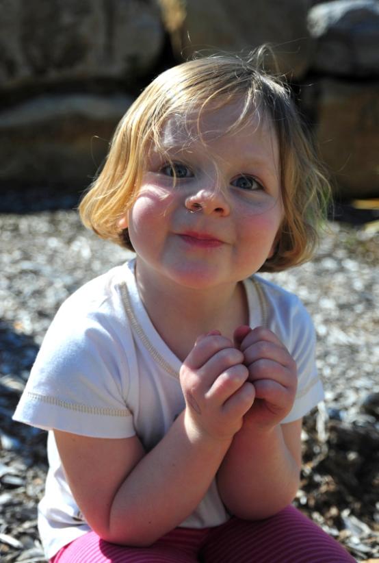
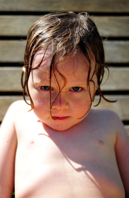
“RideyOman”After much deliberation on the shots I have come to the conclusion that your Shot “BB” of Bridgette is the most
pleasing shot to my eyes. When compared to the other images I feel that you have presented Bridgette beautifully here. The
only improvement I feel may have been a slight rotation of her head perhaps to catch a glint of sun to an eye or two? DOF is
spot on and with no colour adjustments / dodging etc noted well done. Nice composition and pose also.
Other image notes in order of merit:
All in all well done here – you ripped it compared to last time bud.
Not Mate sorry for the delay on your eval – not for any reason but I have been a bit flat of late.
“RideyOman”After much deliberation on the shots I have come to the conclusion that your Shot “BB” of Bridgette is the most
pleasing shot to my eyes. When compared to the other images I feel that you have presented Bridgette beautifully here. The
only improvement I feel may have been a slight rotation of her head perhaps to catch a glint of sun to an eye or two? DOF is
spot on and with no colour adjustments / dodging etc noted well done. Nice composition and pose also.
Other image notes in order of merit:
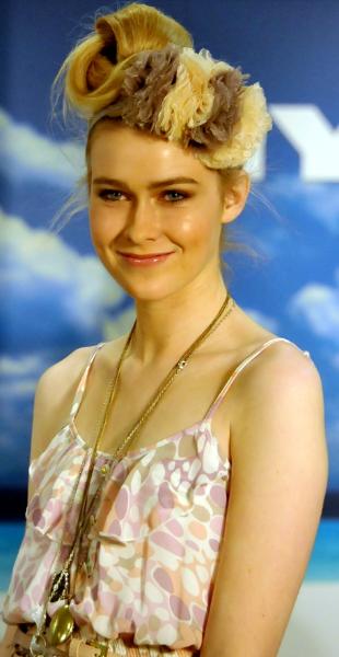
- OK OK Myer Model is a great shot – a little too yellow for my liking however it sort of looks like you stole someone else’s
preparation in this case. Nicely framed and subject ready at the time. Moving out of the way of the letters to only show
the clouds would have made best use of the background which adds nice contrast to the shot also.
- BB2 – I do like this shot as it really goes well with BB (sort of like a heaven and hell type of affair!) It looks like Bridgette
was getting the shits with Daddy by this time? Background works well – a little over exposure to the tummy but adds nice
bounce warmth to Bridgettes face – could have been improved with a adding a reflector to get that sparkle happening to
the eyes. Again even crop works and illustrates scale.
- TC – Yep I do like the natural lighting here – it really works with the fair complexion of your subject’s features. The wind
wisping the hair looks great but more expression may have improved the overall wow factor. DOF good with nice bokeh
appearing.
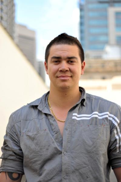
- MP – nice sharp image taken in a casual manner – pose a little ordinary and unironed shirt featured to much. Were you
chasing the tattoo? Perhaps if subject was angled towards you would have created more interest. Great tones all the
same.
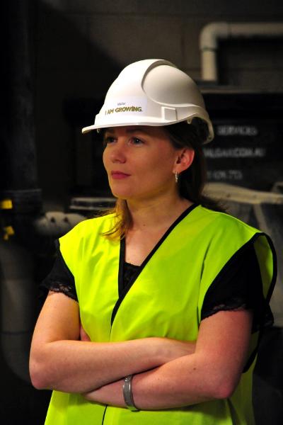
- DN – a well exposed shot but a little to staged for my liking. I also think the helmet could have been lost – your company
slogan reads a little demeaning to your visitor helmets – it gives me the impression that this is a work experience student
rather than making a feature of your subjects worth? Resubmit required. Industrial background adds interest – like a
stage prop too.
All in all well done here – you ripped it compared to last time bud.
Marty's Submissions
Sean's Submissions
| August 2010 Topic: Portrait set by Sean |
This work is by Sean Reason. It is licenced under a Creative Commons Licence
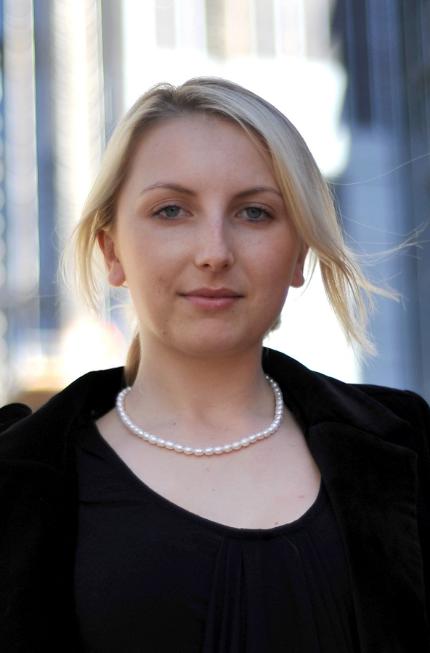
| "John" |
| "Myer Model" |
| "MP" |
| "BB2" |
Martin's photo notes
Had some fun this month with plenty of models putting up their
hands….. Alas, some did not cut the mustard and were painful on the
sensor. The images I have submitted are the shots I feel were most
pleasing to my eye and generally true to topic. I’m just hoping I have
sufficient variety to calm your creative demands.
Some image notes:
DN – Cropped, White Balance Corrected
MP – Cropped, Exhaust Stack Cloned Out
TC – Cropped, Desaturated
BB – Cropped
BB2 – Cropped
Myer Model - Cropped
| "Tracey" |
| "Vandyke" |
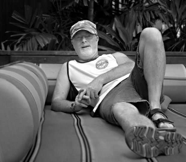
| "Robin" |
| "BB" |
| "Cold smile" |
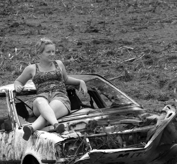
| "Derbied" |
|
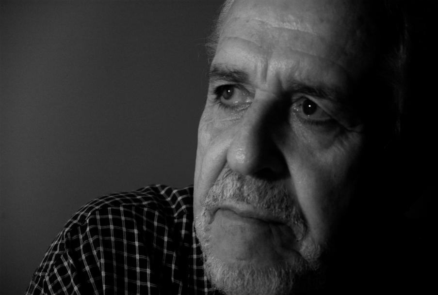
Martin's Pick - score and comments: "Robin"
Back atcha - "Mate sorry for the delay on your eval –
not for any reason but I have been a bit flat of late."
Not too much deliberation here. "Robin" gets the nod
for me this month. I'm sure he was thrilled with the
shot. This is by far the best regarding topic and
lighting. Nice and sharp where it counts also (good use
of the lab). I'm not so crazy about the crop just
skimming of the top of the scalp - this lets down a
terrific shot. I must also add that I think that if the
orientation was portrait, and some more torso was
evident, then the shot may have been improved. I
assume the corner shadowing is your doing also, very
nice if so. I have given you a rocket for your variety. If
one of your shots was in colour I may have let it slip.
Other image notes in order of merit:
Nice stuff again. I really would have liked some more
variety however. You got that D700 yet??
Back atcha - "Mate sorry for the delay on your eval –
not for any reason but I have been a bit flat of late."
Not too much deliberation here. "Robin" gets the nod
for me this month. I'm sure he was thrilled with the
shot. This is by far the best regarding topic and
lighting. Nice and sharp where it counts also (good use
of the lab). I'm not so crazy about the crop just
skimming of the top of the scalp - this lets down a
terrific shot. I must also add that I think that if the
orientation was portrait, and some more torso was
evident, then the shot may have been improved. I
assume the corner shadowing is your doing also, very
nice if so. I have given you a rocket for your variety. If
one of your shots was in colour I may have let it slip.
Other image notes in order of merit:
- Vandyke – still a good shot, but he doesn't look
comfortable, almost unwilling. Lighting is good,
crop is excellent. The image looks as though it
may have been rotated?? Shot is also a little
soft for me. Very much the second place getter.
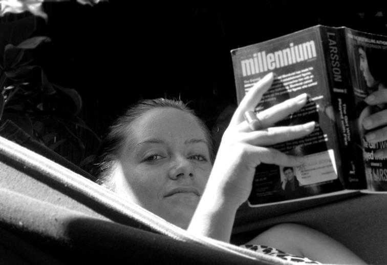
- Tracey – Probably not hitting the topic here, but
the point of view makes for a nice shot. Being
picky, but I would have liked to see the whole
book and left hand.
- Derbied – A great shot but off topic for me. I like
the washed out effect. Is that an old Cortina??
- Coldsmile – Nup. NFQ.
Nice stuff again. I really would have liked some more
variety however. You got that D700 yet??
Sean's photo notes
Well here is my lot - sorry for the lateness - wanted to
wait until our all our guests arrived but hey cant leave
you hanging to much longer.
Ok Photo notes:
Subject Portraiture
Vandyke - Nil Crop - Desat - contrast adj - dodge &
burn where required.
Robin - Nil Crop - Desat - contrast adj - sharpness
added, dodge & burn
John - Crop - Desat - contrast adj, dodge & burn, blur
added
Coldsmile - Crop - Desat, dodge & burn.
Tracey - Crop - Desat, dodge & burn blur added
Derbied - Crop - Desat - contrast adj, dodge & burn
Over to you red leader - send topic over.
Out
| Next month: Before and After - post processing Set by Martin |
| "DN" |
|
Overall with weighting 7.25 10
| "TC" |
Overall with weighting 8.25/ 10