


Sean's photo notes:
Had swag of images to sort
through his month due to the
lens testing and had short listed
the ten images here for your
deliberation comments / shit
bagging and general support :D
big grin
Image notes:
Had swag of images to sort
through his month due to the
lens testing and had short listed
the ten images here for your
deliberation comments / shit
bagging and general support :D
big grin
Image notes:
- Ford_GT40: crop, contrast
& levels (grain is it)
- LV: crop, contrast & levels
- Fireworks: contrast & levels
- Honey egg, crop, contrast
& levels
- Flame of the forest:
contrast & levels
- Bubbled1: crop, contrast &
levels, filter gradient colour
wash.
- A rested colour: crop,
contrast & levels
- Red Raw: crop, contrast &
levels
- Awesome: contrast & levels
- Johno: contrast & levels

| August 2012 Topic: "Colour Photography" |
| "A rested colour" |
|
| NEXT MONTH SUBJECT: Artificial lighting Photography set by Sean |
| Overall with weighting 8.08 / 10 |
Martin's Pick - score and comments: "A Rested Colour"
Finally a taste of the 70-200. Seems you are being very guarded with it. I tried to line a few images up for
deliberation, but I couldn't even second guess the Blue Ribbon shot A-rested-colour.... Crap name, great image.
No idea of your setup or point of view, but I am assuming it was candid and opportunistic. The light and composition
work hand in hand to make a stunning capture. Fine use of exceptional equipment. Well done!!
Other shots in order of merit:
- LV - I nearly submitted this exact image but in twilight. This shot is far better than my dodgy contrasty
attempt. Worthy of the runners up shot. Put a grid over it and it appears distorted and tilted to the left.
- Johno - Great colour hits topic. I think the capture could have shown more zing though. Maybe a frenzied
warrior look or something. The shadow across the mouth detracts a little also. Funky.
- Honey Egg - Marvellously simple, but perfectly shot. This is probably my overall favourite image, but maybe
the wrong month. Absolutely adore the composition - print.
- Awesome - I reckon you were again showing off poncing about with your long lens here braaaz. Nice
engagement with some subjects and I would have cropped to the four closest to get rid of part body in the
background. Harsh midday light was your enemy here. Cute, but not cute enough.
- Fireworks1 - Nice attempt to get this reasonably right. I personally like a longer exposure of 1 sec or so.
Doesn't hit topic for me either. Why have you orientated it 90 deg off??
- Red Raw - Super sharp with a tight DOF. 70-200mm again? Not really fazed about the point of view... but
maybe the light warranted this angle.
- Ford GT_40, Flame-of-the-forest and Bubbled1 - Meh... They belong down here.
| "Honey Egg" |
| "Awesome" |
| _________________________________________________________________________________________________________ |
| "Bubbled 1" |

| "Coffee" |
| ___________________________________________________________________________________________________________ |
| "LV" |

| Other images Sean submitted, click to enlarge |
| "Noisy Water" |
| "Rural" |
|
| Overall with weighting 8.10 / 10 |
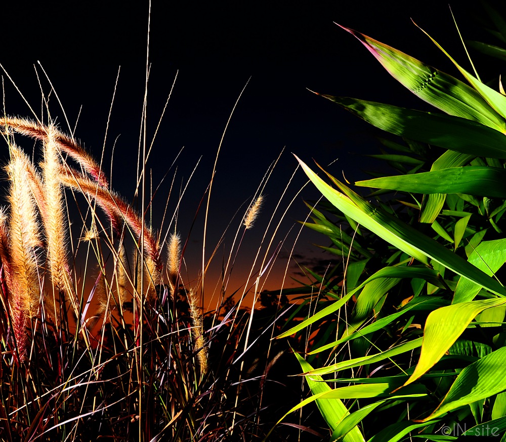
Sean's Pick - score and comments: "Sunset"
Nice stack this month mate, I see you got out and about a bit more which has resulted in good variety and sparked
up your creativity once again.
Up and down the corridors of your submission quite a few times I just had to put forward your image “Sunset” to
take the gong. The colour gradient and blend of hues here is quite fascinating and leads my eyes from left to right
in almost disbelief of the natural colours of the sky bleeding. Good job – I would like a larger photo of this please.
Other images in order of merit:
- Coffee – another well composed – striking shot with well-presented patterned colour. I assume these are
those little coffee cap things you use? Initially I thought they were the ends of incense sticks on display? The
wide angle has create a nice line of symmetry down the middle, lighting sound too.
- Rural, - Yep again well composed rule of thirds, nice use of the shadow to the left it gives the impression of
a single little cloud but I assume there was a silo or building just out of frame. Nice going with HDR here to
pull the texture from the top of the pasture too. The bold colours work for this month, equal second in my
book. Again send me a larger shot of this please.
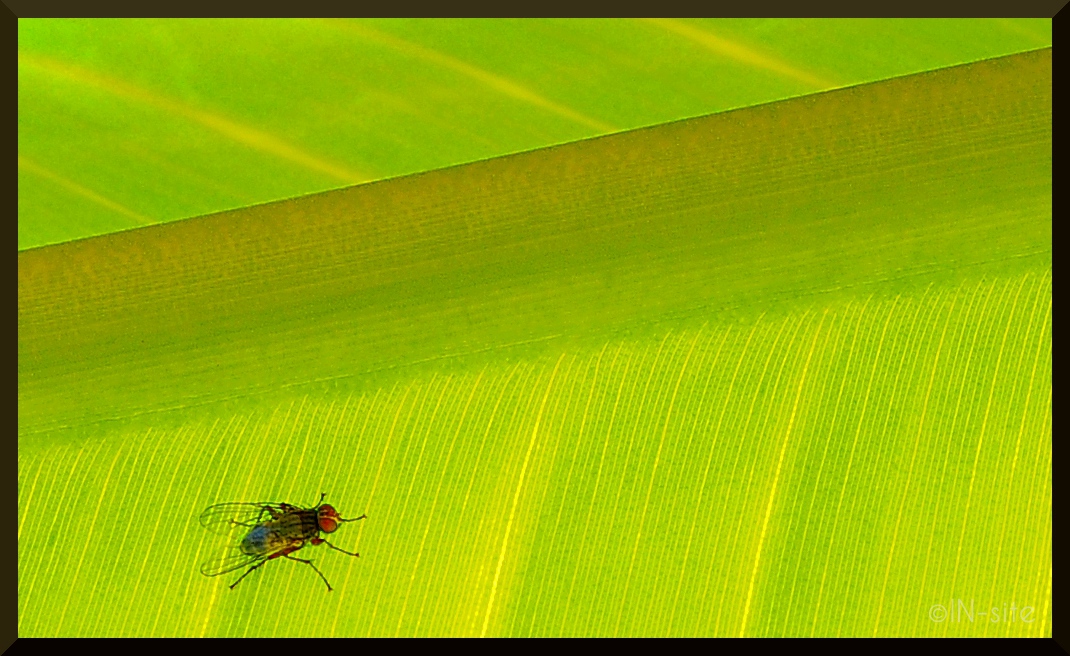
- The Fly, - simple, bright colour, nice and sharp, the border I am uncertain about and I am sort of waiting for
something to happen?
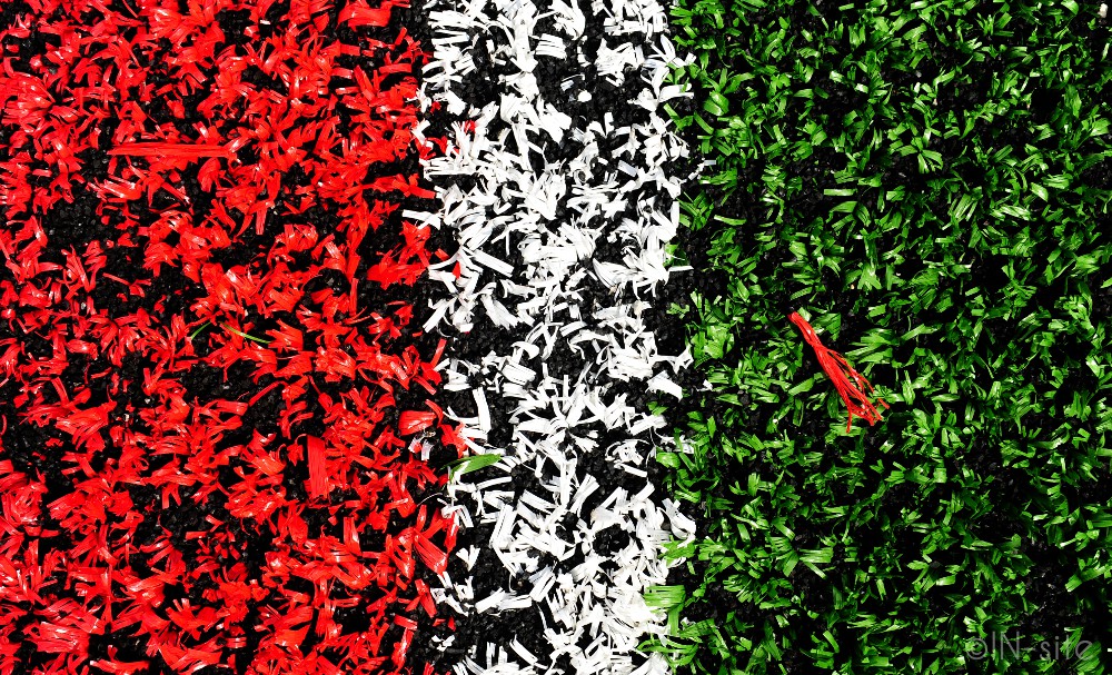
- Defector, - At first I thought this to be bright coloured flower beds however looking a little deeper I see the
astro turf arrangement. It’s a bit quirky its growing on me, It looks a little off focus.
- Colleagues yes – ok but a bit oh hum for my liking..
- Noisy water, - reminds me of one of your previous subs, also you could have introduced some more colour
(gels, or dye?)
| _________________________________________________________________________________________________________ |
| ___________________________________________________________________________________________________________ |
| Other images Martin submitted, click to enlarge |
| "Red Raw" |
Martin's photo notes:
- Coffee - Cropped, sharpened, curves
- Colleagues - Cropped
- Defector - Cropped, levels
- Noisy Water - Cropped, colours,
sharpened
- Rural - HDR, Cropped, Curves
- The Fly - Cropped, sharpened
- Sunset - Cropped, colours, sharpened
| "Sunset" |
| "Johno" |
| "Colleagues" |
| "Ford GT40" |
| "Defector" |
| "The Fly." |


| "Fireworks1" |
| "Flame of the forest" |


|
