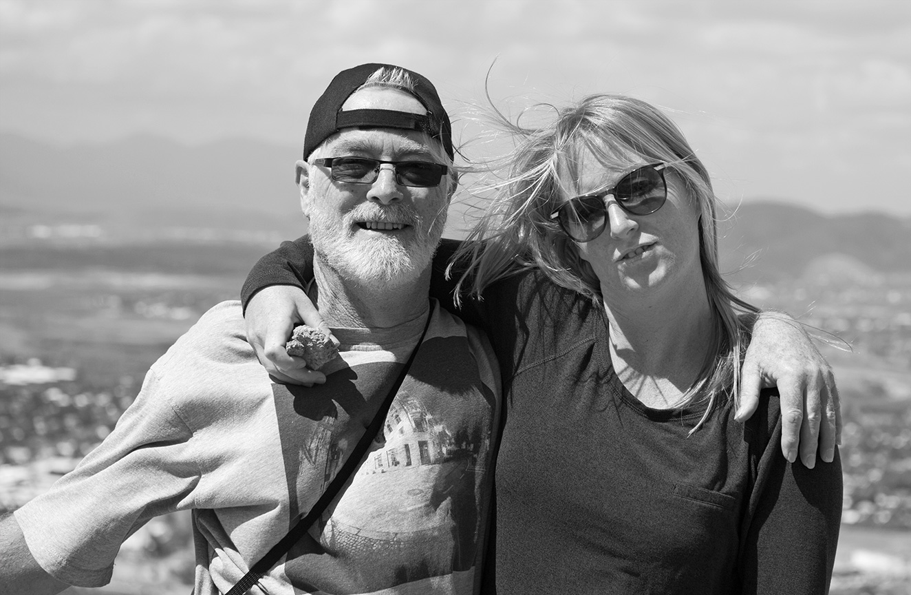
Martin's submission notes:
Meh. Portraiture is a science methinks.
Best done with good lighting and
professional models.
I had neither.
Here's my lot. All had crop, colours and
curves.
August 2013
Topic: "Portrait"
|
Other shots Martin submitted
|
______________________________________________________________________________________
|
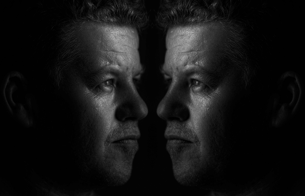
Sean's submission notes:
All adjusted (levels, contrast etc)
Falling is obviously a montage of portraits
All cropped except Brother &Sister and
E and J,
Me is a mirrored photo conducted in post.
Relevance to Topic
|
9
|
Composition
|
7.5
|
Use of Light
|
8.5
|
Wow Factor
|
8
|
I wish I took this!!!
|
8
|
Variety
|
8
|
|
Overall with weighting 7.73/10
|
Sean's Pick - score and comments: "Admin Sue"
Easy one for me this month. Not a bad spread this month, I can see you hit the road and pestered a few subjects for a
shot or two. Its not an easy topic when you try and fit it in with everything else going on in our lives.
I came down to two best shots for consideration and Admin Sue got it for me. I like the up close and personal
approach with the head tilted a little. Although the IT equipment and frame doesn't’t work for me the clear eye focus,
exposure and general happiness evoked with Sue’s grin makes it the stand out.
- Surgeon Ash, which adopts the classic pose and neutral background. Good connection with your subject and a
lower shooting angle centers him pretty well. Perhaps too much background above the head. Colours work well.
- President Llewellyn, is well framed slightly hot exposed shot with good eye connection. It is let down a little
with a caught by surprise mouth position but the contrast with the background works well.
- Craftsman is OK – needed to get closer I feel on the face with the foreground fingers doing their work.
Background a bit busy, needs some contrast as feels a little flat on screen?
- Hutton Stance, would have loved to see the eyes on you. Crop a bit to narrow but man that kid is growing up.
Exposure pretty good – some fill flash or dodging could have lifted face a bit.
- LNP Dave had the makings of a good shot if you had a flash, the balloons above the head should have been to
one side as they mix the attention on your subject. There was a lot of possibilities with all the props there –
should have thought this one through some more.
- Nurse Breda appears to be a bit bothered by your request. Light on her chest would have worked better if
overhead coming down between glasses to make eyes light up. Use of background prop is complementary
though.
- Lovers a little to candid and grainy to comment here..
_________________________________________________________________________________________________________
|
___________________________________________________________________________________________________________
|
Relevance to Topic
|
10
|
Composition
|
9
|
Use of Light
|
9
|
Wow Factor
|
7
|
I wish I took this!!!
|
10
|
Variety
|
7
|
|
Overall with weighting 8.45/10
|
Martin's Pick - score and comments: "E & J"
OUTSTANDING - winner by several streets is E and J. Just get a large format print, hang it, sit back and smirk.
This could be what pops up when you Wiki "portrait".
Other shots in order of merit:
- Watermelon Grin – Another great example. Maybe a little short on DOF. Likey.
- Falling - Portrait? Maybe. It is in any case a well worked and well filled frame.
- Cupcaked - Yup nice grab. Great lighting and model connection. Perfect Facebook post.
- Me - Rock star stuff going on here..... Cant really fault it apart from saying the model is looking a little worn.
Lighting arrangement is puzzling me a bit here.
Other shots out of the mix, but there were no shots I did'nt like. Overall this submission was up there with your
best to date.
___________________________________________________________________________________________________________
|
Other shots Sean submitted
|