


Sean's Pick - score and comments: "Clinton got the bally"
Ok considering you submitted 15 shots after my entry of 7 images I have
short listed your lot down to an equal seven number also.
My pick for this month is "Clinton got the bally" as it has all the makings
of a classic pet portrait shot and I am sure that we will forever be grateful
you captured him this way. The use of DOF works well - as does the way
his teeth are featured.
Other selected photos in order of merit;
Keep up the good work – looking forward to this month bras
Ok considering you submitted 15 shots after my entry of 7 images I have
short listed your lot down to an equal seven number also.
My pick for this month is "Clinton got the bally" as it has all the makings
of a classic pet portrait shot and I am sure that we will forever be grateful
you captured him this way. The use of DOF works well - as does the way
his teeth are featured.
Other selected photos in order of merit;
- Imposter: Yeah I like where you were going with this shot, it sort of
is reminiscent of the type of wallpapers I have seen backlit in
bathrooms, you mentioned paint applied? Did you paint that red
thingy?
- Stone Age: I do like the way you have put together the multiple
exposure in camera here – it does work and look a little creepy – I
think we should do multiple exposures as a topic one day.
- Castle: Not a bad looking shot, I feel the crop was too mean at
the bottom of the building.
- Emma: Yeah I was there and have much the same shot, I think
you pushed the sat a bit too hard.
- Flora in oil: It comes together ok and I sort of like the image – just
would prefer to evaluate a top notch photo not access post
processing effects m8..
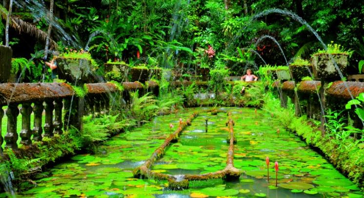
- Seating: I did like this shot when I reviewed all the images of
Paronella Park with you but on it’s own now I am not so sure – lets
say the last three were as good as each other.
Keep up the good work – looking forward to this month bras
Martin's Submissions
Sean's Submissions
| December 2010 Topic: "Your best shots for the month" set by Sean |
This work is by Sean Reason. It is licenced under a Creative Commons Licence
| "Look out" |
| "Morning Brew" |
| "Seating" |
Martin's photo notes:
Hey Braaaaaz;
Yup I was waiting for you to
submit. I was also hoping to
get some decent light for a
shot I wanted..... But no cigar
- weather is crap once again.
Glad we are not in a frigging
flood zone though.
I have included shots from
Paronella Park also. I know
you already have all mine, but
I may have applied some
different processing that may
be of interest....
Image notes:
- Flora in Oil - Cropped,
Oil Painting effect
applied
- Stone Age - Multiple
Exposure, contrast
- Clinton got the bally -
Cropped, levels
- Imposter - HDR,
cropped, paint applied
- Castle - HDR, Cropped,
cable cloned out
- Emma - HDR, cropped
- Seating - HDR,
cropped, levels
| "Waterfall" |
| "Bamboo" |
|
Sean's photo notes
Ok here is my lot for the month
Photo notes:
It was really good to get out there this
month with you bud we have to do it
more often.
Love to the gang
Seano :)
Ok here is my lot for the month
Photo notes:
- Ballie - Cropped, levels
- Bamboo - HDR - Levels, Contrast
- End - HDR - Levels, Contrast
- Lookout - Levels - shadow adjustment
- Morning Brew - not a flattering shot of
Em but i like this portrait, - HDR,
black and white, contrast
- Trace and Emma - Crop, levels,
brightness
- Waterfall - HDR, Levels, colour,
contrast
It was really good to get out there this
month with you bud we have to do it
more often.
Love to the gang
Seano :)
| NEXT MONTH: Contrast - Set by Martin |
|
Overall with weighting 7.90/ 10
| "Ballie" |
Overall with weighting 7.85/ 10
| "Flora in oil" |
| "Emma" |
| "The end" |
Martin's Pick - score and comments: "Morning Brew"
A real 50/50 bag for me this month. I see 3 shots that have exceptional qualities and very few (if any) flaws, and 4
shots that I deem to be below your Par......
So here's the verdict.....
My pick for this round is Morning Brew. This shot has it all. Firstly, the title is an absolute fit. There is interest
everywhere. You could show this to most people and they would relate to it. B&W works well, the light has been
preserved well by not over pushing the HDR. You are the monochrome master.
Other pictures in order of merit:
- Lookout - Stock shot perfectly executed. Great depth of field, not too saturated, nice light. Print.
- Thelma & Louise - Really nice light and perfect point of view. Just wondering where you cropped?? I hope not
the right edge?? Anyways, top notch capture.
- End - Dunno what it is about this shot, maybe the distortion, the lean, or the crop, or the point of view..... It
just dos'nt do it for me.
- Bamboo - Nice HDR, but little interest. The tree trunk on the right also detracts.
- Waterfall1 - there is really nothing I like about this shot. Maybe because I was there and I have the same
scene. It looks distorted, the colours don't work and the composition leaves me wondering what else should
be in the frame.
- Ballie1 - Would have been a lot nicer with a shallower depth of field to improve the background. The shutter
speed is good though. A little more crop to remove the thingys top left and bottom right.

| "Imposter" |
| "Stone age" |
| "Castle" |
| "Clinton got the bally" |
| "Thelma and Louise" |
| "Morning Brew" |