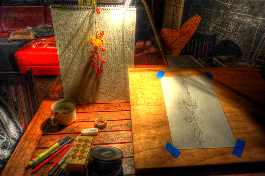

Marins's Pick - score and comments: "Emma's Art"
Nice little pot of images this month. No doubt in my mind that "Emma's-Art" scores top
billing. Great composition, right lighting, terrific subject, and plenty of subtle reds to hit
topic. The sheer fact that you have created a piece of art from Emma's work in progress
further enhances appeal. I had to strip you some points for the HDR. I'm calling it
"manipulation" but I would accept your protest. I also note the lens case..... Bastido!!
Other image notes in order of merit:
The D700 is starting to sing for you I see.
I may have to come and see you for a little 1 on 1 tuition, and to try that frigging new lens
of yours out.
NFQ
Nice little pot of images this month. No doubt in my mind that "Emma's-Art" scores top
billing. Great composition, right lighting, terrific subject, and plenty of subtle reds to hit
topic. The sheer fact that you have created a piece of art from Emma's work in progress
further enhances appeal. I had to strip you some points for the HDR. I'm calling it
"manipulation" but I would accept your protest. I also note the lens case..... Bastido!!
Other image notes in order of merit:
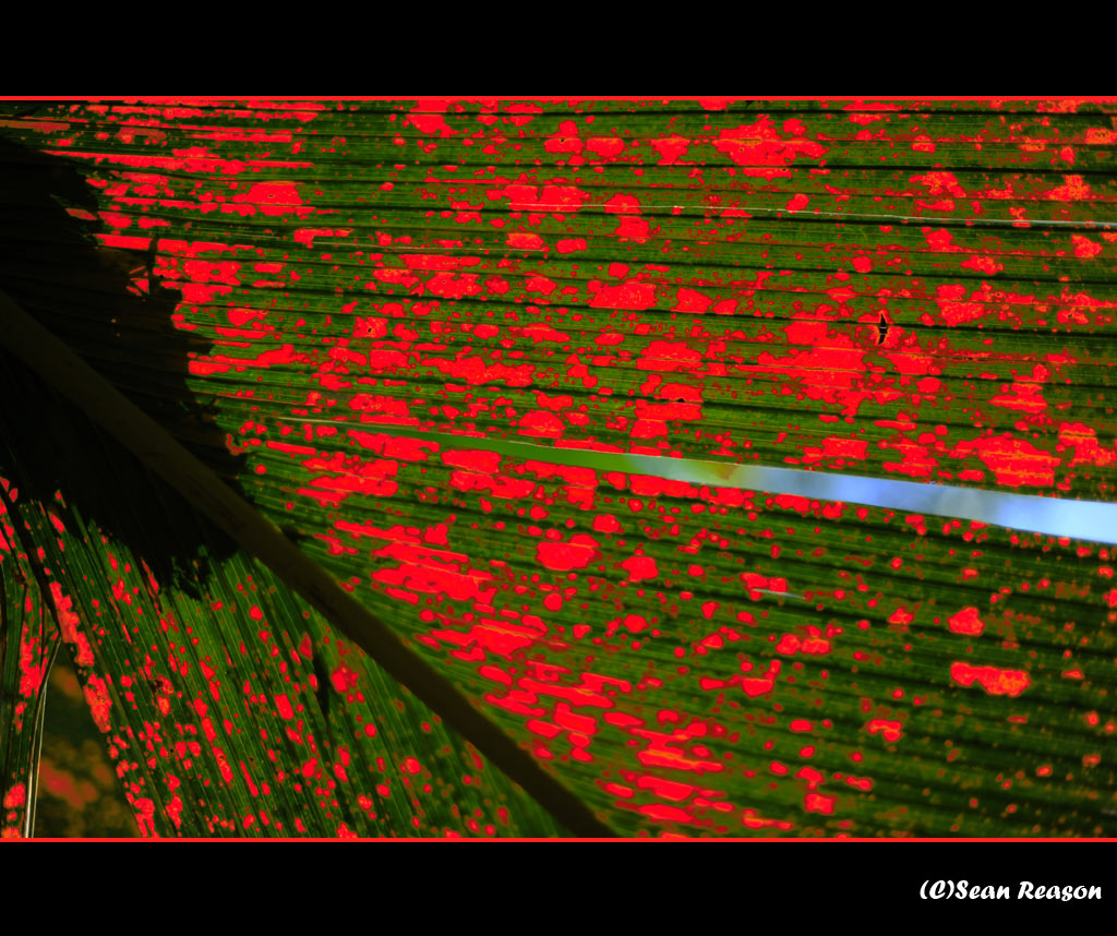
- Redpalm – Whatever you did to the colour etc is not obvious / evident. Great result.
Another print.
- Poinciana - Terrific looking shot overall. I think if you had a headstone in the very
close foreground the shot may be improved. You probably do have one heh? Note
my submission.....
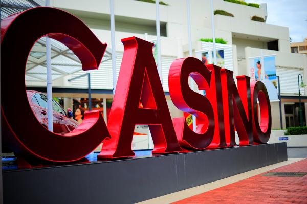
- Casino – I suppose its OK. Not really in the same league as the others, but good for
variety.
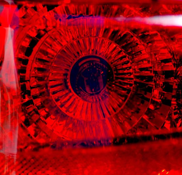
- Taillight – Hmmm... If this was'nt cropped then I might like it a bit more. I just don't
like the crop you have applied. I would have gone in real tight. Nice reds though.
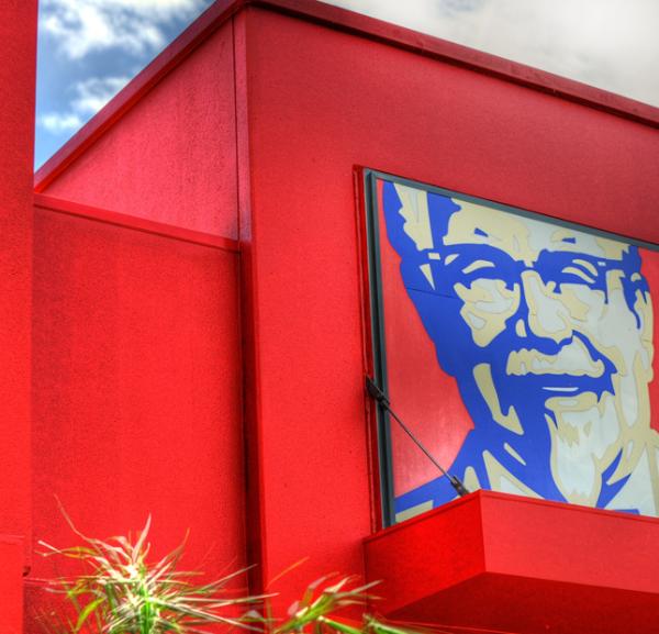
- The-Colonel – Nup, don't like it.
The D700 is starting to sing for you I see.
I may have to come and see you for a little 1 on 1 tuition, and to try that frigging new lens
of yours out.
NFQ
Sean's Submissions
Martin's Submissions
| November 2010 Topic: "Red" set by Martin Images that have the colour red as the discerning feature |
This work is by Sean Reason. It is licenced under a Creative Commons Licence
| "Conrad" |
| "Hot foot" |
| "Tail light" |
| "Red Palm" |
Sean's photo notes:
I am first for a change! It
felt like we had a lot more
time available this month
but I must say the topic
was not the easiest to grab
a hold of. I am looking
forward to see your
submission.
Photo notes:
As you can see I am having
HDR sweats again.
I am first for a change! It
felt like we had a lot more
time available this month
but I must say the topic
was not the easiest to grab
a hold of. I am looking
forward to see your
submission.
Photo notes:
- Casino : nil crop, hdr
- Red Palm: crop &
colour change,
experimented with a
frame for good
measure
- Tail light: cropped,
levels,
colour/brightness
- Poinciana: nil crop,
hdr
- Emma's art: nil crop
hdr
- The Colonel:
cropped, hdr, colour
boost, dodge whites.
As you can see I am having
HDR sweats again.
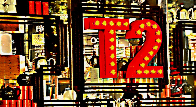
| "Tea Two" |
| "Myer Window" |
| "Courage" |
|
Martin's photo notes
Braaaz;
Thanks for allowing me some
grace this month. The shot I
was trying to get really needed
some harsh sun..... We haven't
had sun now for 2 weeks, so I
didn't get the shot I was after.
Some notes on my lot:
Braaaz;
Thanks for allowing me some
grace this month. The shot I
was trying to get really needed
some harsh sun..... We haven't
had sun now for 2 weeks, so I
didn't get the shot I was after.
Some notes on my lot:
- Anzac Square -
Cropped, levels
- Casino - 3 stack HDR,
cropped
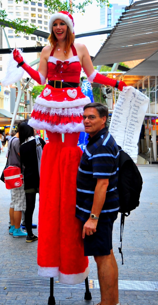
- Christmas List -
Cropped, saturation (you
will see that I made the
list..... You didn't)
- Conrad - 3 stack HDR,
cropped
- Courage - 3 stack HDR,
saturation, cropped
- Hotfoot - Levels,
saturation, cropped
- TeaTwo - Saturation,
heavy unsharp mask,
cropped
- Myer Window - Cropped,
sharpened
| NEXT MONTH: Your best shots for the month! Set by Sean |
|
Overall with weighting 8.25 / 10
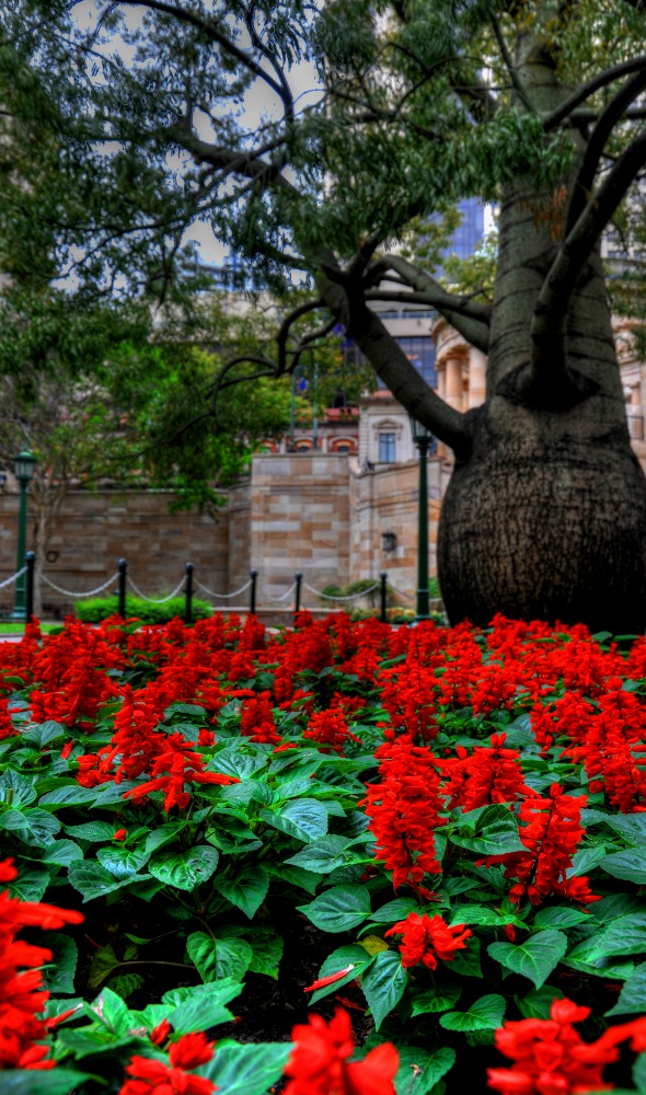
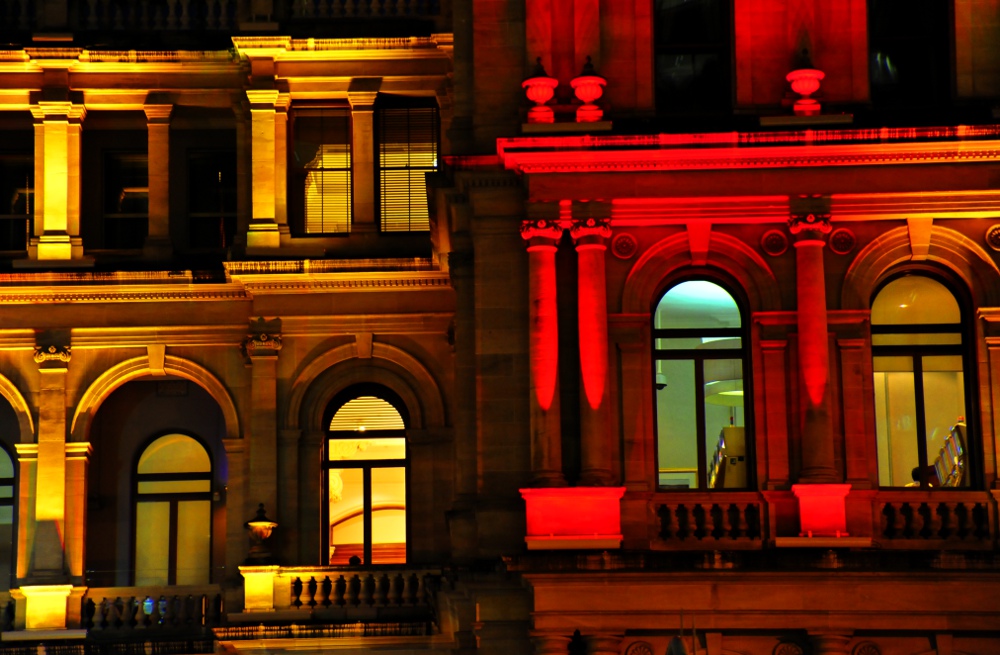
| "Anzac Square" |
Overall with weighting 8.20/ 10
| "Poinciana" |
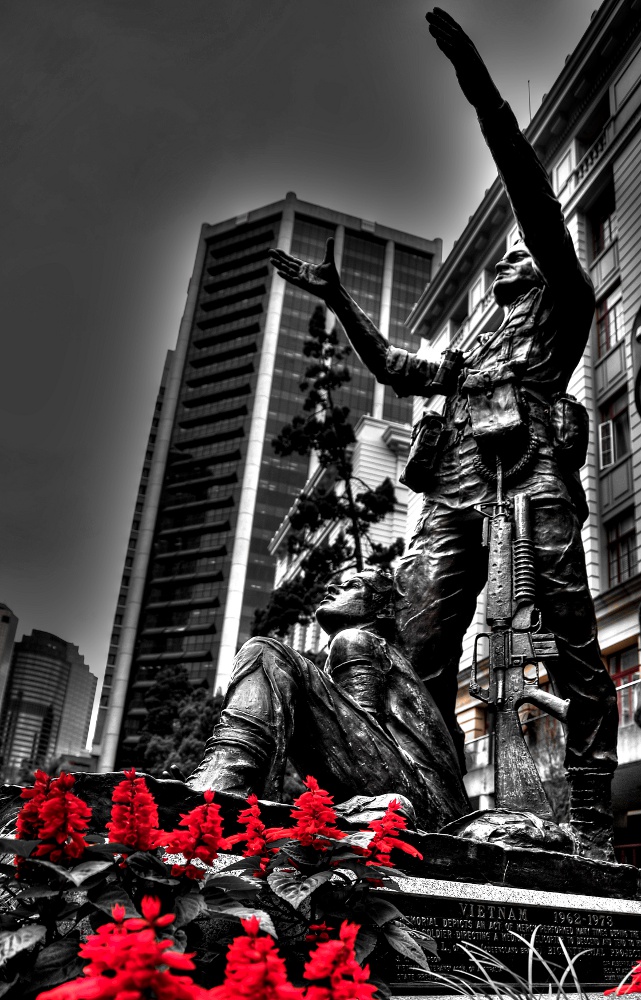
| "The-Colonel" |
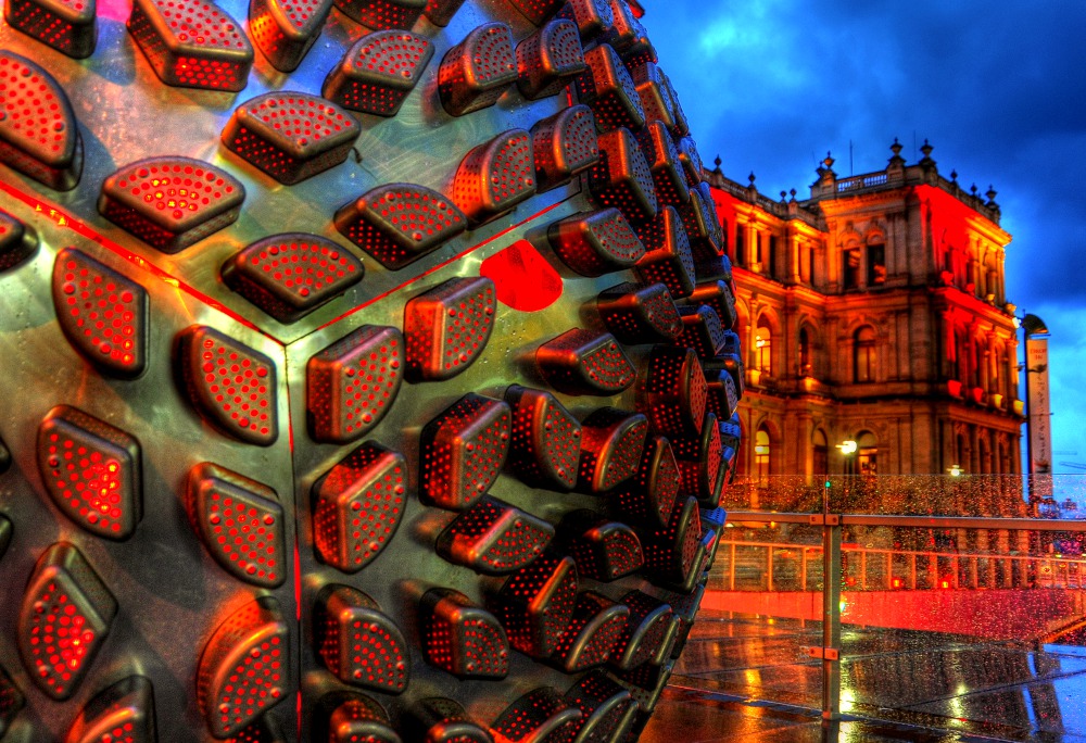
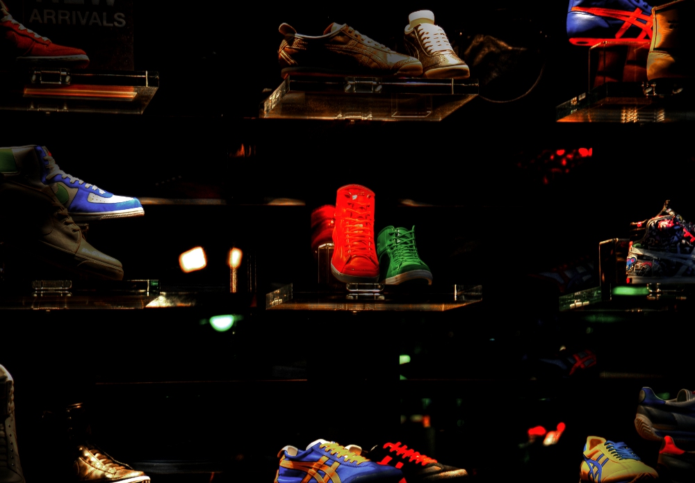
| "Casino" |
| "Emma's Art" |
| "Casino" |
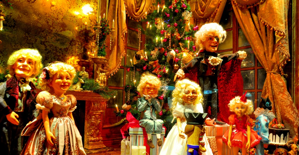
| "Christmas List" |
Sean's Pick - score and comments: "Casino"
Nice bundle this month - the variety is good also. Composition / use of colours & textures really narrowed my field
down to the Casino submission mate - also a bit trippy that he both had the"Casino" angles going?
Technically I love how you need to explore so many things - it is a unusual combination of the arts with the
environment also brought well into the image with glistening water on the glass.
The way you have over saturated the reds also works & fits in nicely with your topic. You must have thought this was
a keeper pretty early on?
Other photos in order of merit:
- Hotfoot, yeah nice lab work (hand held or tripod) perhaps red boots focus slightly off – the photo is cool and
cropped well.
- T2 – I like this image – but it hurts me to read into it – pushed to the max interestingly punchy.
- Anzac Square – nice capture and comfortably put together – worth using the background and on topic well.
- Courage – the haloing puts me off, thought of doing the same thing with a submission but decided not to go
into these waters – was this the shot you had planned to get?
- Myer Window – realistically I would have expected this sharp, the little people look a bit scary! Perhaps more
depth and on a tripod would have worked better. Colours over done
- Conrad – yeah again more depth of field and feels a bit unbalanced for me. Nice textures could have been
explored. More stops of exposure much needed I reckon.
- Christmas list – nup.. Hey I had better be on that list god gangit!