


Martin's Submissions
Sean's Submissions
| "Highlighter" |
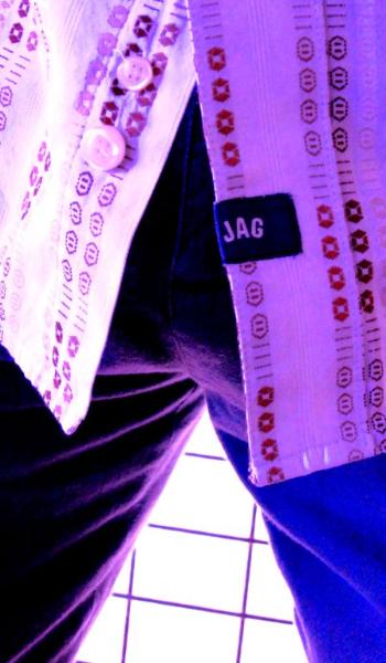
Sean's Pick - score and comments "Jag"
Mate, Good attempt with 12 shots to pick from - One really works for me bra but don't worry you got there
in the end.. I think the main issue you faced was the marketing side of the house - I would have liked you
to push the relationships of things to your subject to give them something to spring off the screen and
say "Check me out I work", - I cant say much as most of mine were alcohol induced but I tried to work
with them in their setting - selling the product.
Jag certainly is worthy to take this out bra, I love this shot! The only critique I have is the loose thread
lets down the subject – I am sure Jag would have burnt it off or a drill sergeant before local leave!
I like the night club feel with the mod light wall and the half a bar in your pants - god knows what the
background actually is but it does’t matter as it all comes together nicely – to the point I can practically
smell the brut aftershave and takes me back to the “Wintergarden or Alexanders days”
Ok other image notes (forgive my bluntness)
• Efficiency has the makings of a good shot but only the glasses are in good focus and you have cut quite
a bit of them away? I am not sure what I am supposed to be looking at?
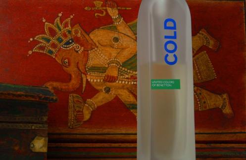
• Benetton - Nice shot of the bottle - however i reckon your background should of been something using
ice to work with the name. Good exposure
• Buzz – nicely framed shot with well composed
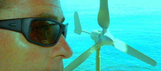
• Sapphire – This should be in next month! – nice shot of you all the same - just get a hint of the reflection
of the wind turbine cool
• Fish – you just could let the opportunity for that wind turbine go could you bud – I think this would of
worked better with your head tilted like in the shot Sapphire better
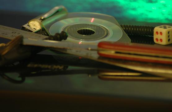
• Highlighter – This would have to be my second pick, only because it has been taken really well - not sure
with the background.
• Lowepro – Sometimes the shit under your nose does't get a look – almost there but rotating Nikor out
would have been better to put the attention back onto the bag name - perhaps two lenses to express the
bags worth?
• Parnters in Rhyme – I like lilys but again not sure of the relationship – this would of worked with your
funky Jag shot better – let me hear that noise sort of thing.
• Pall Mall – Reminds me of the good ol days – your passport for success sort of thing, well focused on
subject – angle not sure but nice shot
• Trouble – Out of your options with which guy is out of focus - the dingo works better in this case i reckon
Mate, Good attempt with 12 shots to pick from - One really works for me bra but don't worry you got there
in the end.. I think the main issue you faced was the marketing side of the house - I would have liked you
to push the relationships of things to your subject to give them something to spring off the screen and
say "Check me out I work", - I cant say much as most of mine were alcohol induced but I tried to work
with them in their setting - selling the product.
Jag certainly is worthy to take this out bra, I love this shot! The only critique I have is the loose thread
lets down the subject – I am sure Jag would have burnt it off or a drill sergeant before local leave!
I like the night club feel with the mod light wall and the half a bar in your pants - god knows what the
background actually is but it does’t matter as it all comes together nicely – to the point I can practically
smell the brut aftershave and takes me back to the “Wintergarden or Alexanders days”
Ok other image notes (forgive my bluntness)
• Efficiency has the makings of a good shot but only the glasses are in good focus and you have cut quite
a bit of them away? I am not sure what I am supposed to be looking at?
• Benetton - Nice shot of the bottle - however i reckon your background should of been something using
ice to work with the name. Good exposure
• Buzz – nicely framed shot with well composed
• Sapphire – This should be in next month! – nice shot of you all the same - just get a hint of the reflection
of the wind turbine cool
• Fish – you just could let the opportunity for that wind turbine go could you bud – I think this would of
worked better with your head tilted like in the shot Sapphire better
• Highlighter – This would have to be my second pick, only because it has been taken really well - not sure
with the background.
• Lowepro – Sometimes the shit under your nose does't get a look – almost there but rotating Nikor out
would have been better to put the attention back onto the bag name - perhaps two lenses to express the
bags worth?
• Parnters in Rhyme – I like lilys but again not sure of the relationship – this would of worked with your
funky Jag shot better – let me hear that noise sort of thing.
• Pall Mall – Reminds me of the good ol days – your passport for success sort of thing, well focused on
subject – angle not sure but nice shot
• Trouble – Out of your options with which guy is out of focus - the dingo works better in this case i reckon
Overall with weighting 8.25 / 10
|
"Benetton"
Overall with weighting 9.10/ 10
|
"Buzz"
"Jag"
"Lowepro"
"Fish"
"Trouble"
"Sapphire"
"Pall Mall"
"Efficiency"
"Partners in Rhyme"
Martin's photo notes
1. Fish – Heavily modified and cropped
2. Affinage – Cropped and contrast
3. Benetton – Colour saturated and cropped
4. Buzz – Untouched
5. Efficiency – Untouched
6. Sapphire – Contrast washed and de-saturated. Cropped.
7. Highlighter – Untouched
8. JAG - Heavily colour modified and cropped
9. Lowepro – Cropped
10. Partners in Rhyme – Untouched
11. Pall Mall – Untouched
12. Trouble - Untouched
| February 2009 Topic: Product photography set by Sean |


"Affinage"
Sean's photo notes
1) Finlandia - untouched (ok resized)
2) Crazy - Photoshop and Aquarium & AV - spot the face
3) Cold as dice - untouched
4) Bond's Pockets - untouched
5) Jacobs - slight level change
6) Sports hall of fame - White balance change
7) Tequila times - brightness change and slight crop
1) Finlandia - untouched (ok resized)
2) Crazy - Photoshop and Aquarium & AV - spot the face
3) Cold as dice - untouched
4) Bond's Pockets - untouched
5) Jacobs - slight level change
6) Sports hall of fame - White balance change
7) Tequila times - brightness change and slight crop
"Finlandia"
"Crazy face"
"Sports Hall of Fame"
"Jacobs"
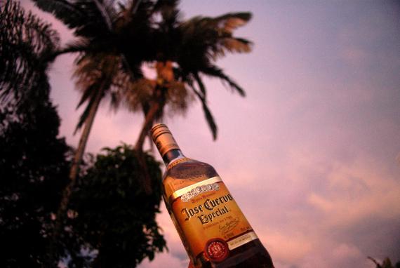
"Tequila times"
"Bond's pockets"
"Cold as dice"
Martins Pick - score and comments
Finlandia
A really tough choice this month. It just had to be a grog shot
though. It is the colour that swayed me. Then came the
slight "out of kilter", the "off plumb", and the slight flaws in
the background that really nails it. Great decision not to crop
or try to correct. Where's my glass?
Other image notes:
Bonds Pockets - Great name, interesting arrangement. I
would have preferred a little more depth of field - just a little.
Cold as Dice - Great colours and texture. Maybe shot from a
little higher point of view would have enhanced the interest.
And a little burning to the dice maybe??
Crazy face - Too bloody right. Yup got the face, you have
aged Bra. I find it a little difficult to look at. I don't see a
connection with the Topic. Wild though.
Jacobs - Terrific shot. Near perfect lighting. If anything
detracts from the shot it would have to be the cropping, that
roller door keeps catching my eye. A slightly rightish point of
view may have improved this shot. Love it. This was a close
second.
Sports Hall of Fame - Iconic shot. Well framed. No flash -
brilliant. Maybe a little more of the bow would have given it a
"hard" edge. The splashes of red really bring it to life.
Tequila Times - Yup. Now I am really thirsty. Good light. That
little dag bottom left.... Annoying. What were you thinking? /
Drinking? NFQ
| This work is by Sean Reason. It is licenced under a Creative Commons Licence |