


Martin's photo notes:
This Yeah yeah….. Late again. I’ll blame the
incessant rain.
Always love a monochrome.
Image notes: All cropped, desat, curves
This Yeah yeah….. Late again. I’ll blame the
incessant rain.
Always love a monochrome.
Image notes: All cropped, desat, curves
- Contained – rotated
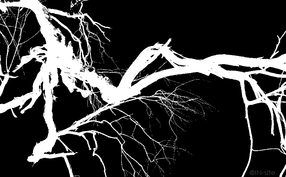
- Gnarly – inverted
- Baby Brown – border, sharp
- Wise words – nil
- Sunflowers – cloning to background
- Commuter – nil
- Vandals – nil
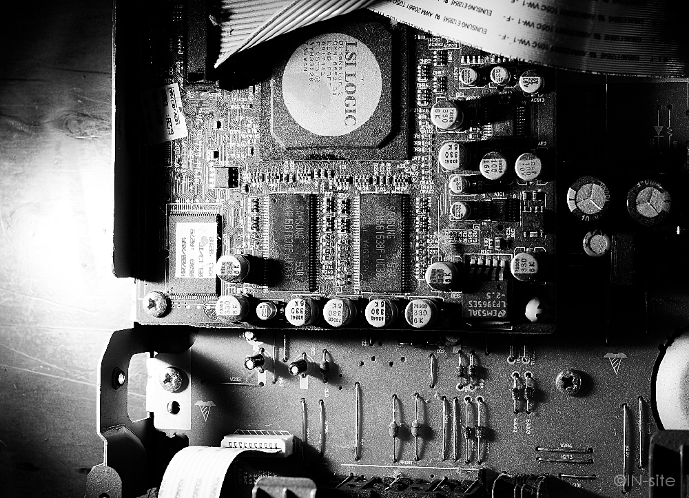
- Circuit – sharp
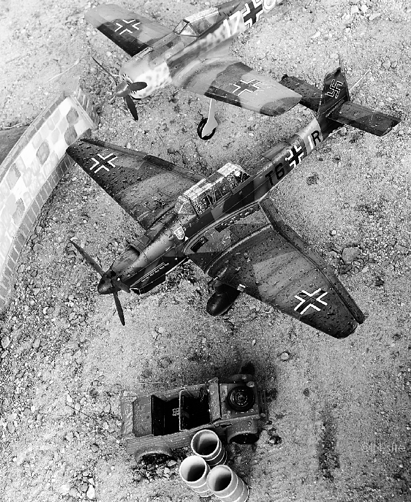
- Luftwaffe – nil
| February 2013 Topic: "Monochrome" |
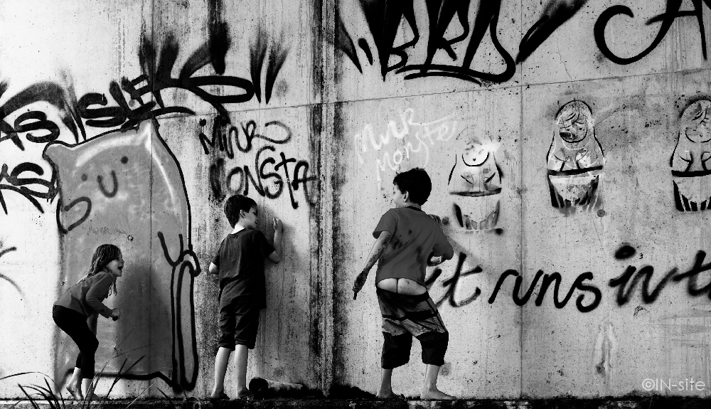
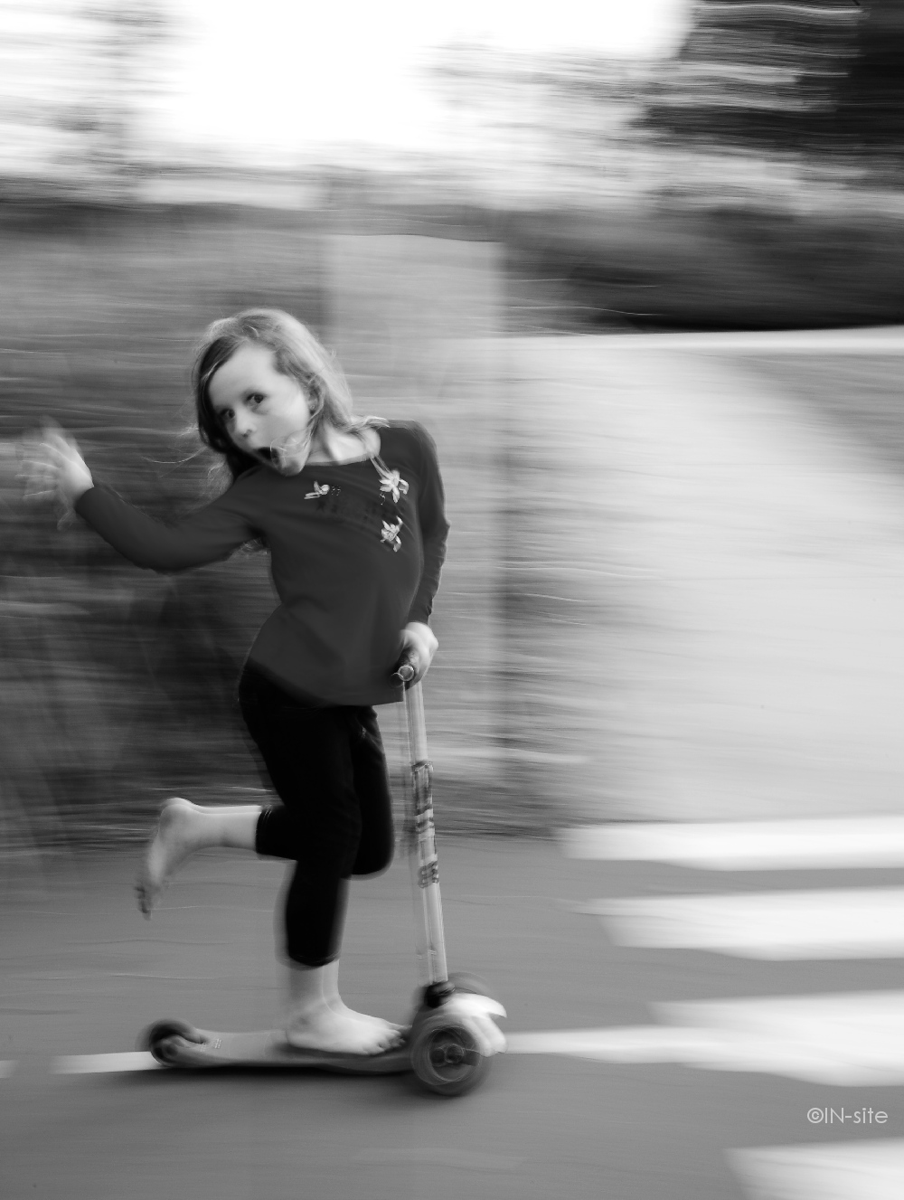
| "Vandals" |
|
| NEXT MONTH TOPIC: Colour |
| Overall with weighting 8.40/10 |
Sean's Pick - score and comments: "Vandals"
Rideyo Man about time your ones came through.
I can see this topic works well for you, I too like the way in which monochrome forces one to see the picture more
rather than with the distraction of colour, with this I did really enjoy viewing your bunch this month.
My pick out of your lot had me coming back to two images in the end Vandals & Commuter and in the end I selected
Vandals. I like the fly on the wall point of capture as your presence is not noticed and the lower advantage point
works well with your young subjects. Composition off a little with perhaps some cropping needed to the right.
The gritty way this has been processed works well with the black and mid tones. The life and expression between “B”
and her mate with his bum hanging out is priceless. Good work.
What I like about this shot is the scale of “B” in relation to her scooter & body statue. Again with the lower advantage
point you could be mistaken that she was “adult size”. So good compositional work here. The panning work is not
bad – not as perfect as you could have got face focus better with tracking in time with her speed.
Ok other image notes:
Rideyo Man about time your ones came through.
I can see this topic works well for you, I too like the way in which monochrome forces one to see the picture more
rather than with the distraction of colour, with this I did really enjoy viewing your bunch this month.
My pick out of your lot had me coming back to two images in the end Vandals & Commuter and in the end I selected
Vandals. I like the fly on the wall point of capture as your presence is not noticed and the lower advantage point
works well with your young subjects. Composition off a little with perhaps some cropping needed to the right.
The gritty way this has been processed works well with the black and mid tones. The life and expression between “B”
and her mate with his bum hanging out is priceless. Good work.
- So in second place then Commuter gets it.
What I like about this shot is the scale of “B” in relation to her scooter & body statue. Again with the lower advantage
point you could be mistaken that she was “adult size”. So good compositional work here. The panning work is not
bad – not as perfect as you could have got face focus better with tracking in time with her speed.
Ok other image notes:
- Contained, is a cracker silhouette of you bras, I too felt a few of my shots would have worked if covered in
other topics, I guess that’s why we do this stuff hey – experimentation and learning is so cool with
photography. This shot reminded me of that “crimsafe” commercial, or perhaps a frog on a window. Striking
pose and nice and black where needed. Nice.
- Baby Brown, – The old floating snake on a rock? I had a double look at this image then another double look
to be sure. I see what is going on now – good illusion. Not sure about the fat black boarder but an interesting
shot all the same. You sure it’s a brown and not a copper head?
- Gnarly, pretty artistic inversion, looks a bit like a brush stroke. Simple yet busy – I get it.
- Wise words, good subject name – lacks wow factor. Difficult lighting conditions too.
- Luftwaffe, you could have done so much more with these props, what no action, movement, smoke, dust,
destruction?
- Circuit, nice side lighting, gritty too – just a bit oh hum for me.
| ____________________________________________________________________________________________________ |
| "Gnarly" |
| ________________________________________________________________________________ |
| Other images Martin submitted, click to enlarge |
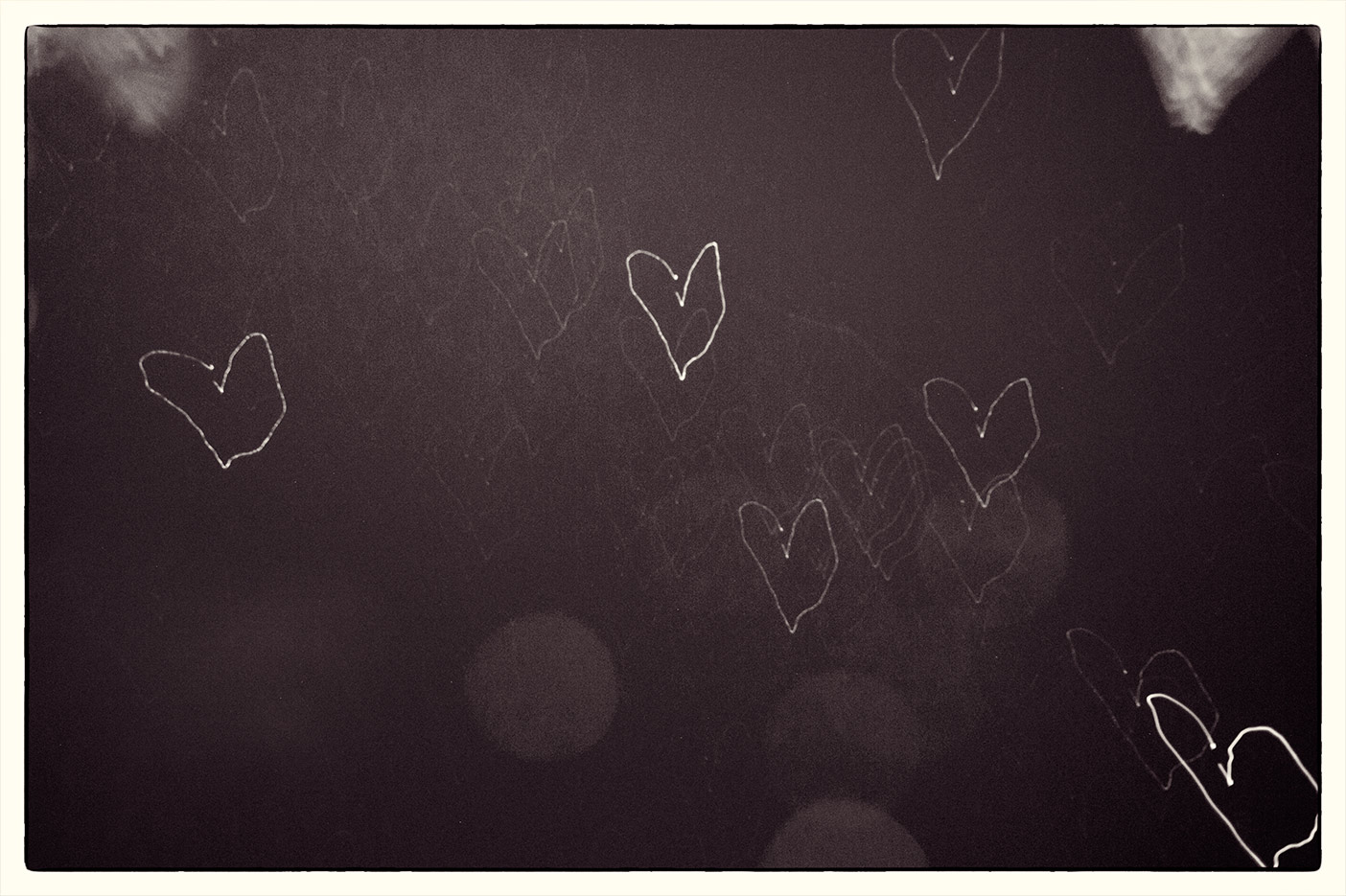
| "Star Hearts" |
|
| Overall with weighting 8.43/10 |
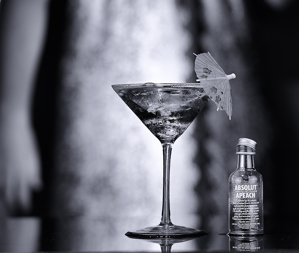
Martin's Pick - score and comments: "Peachy"
Ok You gotta excuse my eval being a little overdue, but with so many shots to go through, cull, pull to pieces,
rebuild; I am exhausted. De Ja Vu..........
Yet again at my first impression there was a clear standout. This shot has some real interest going on and stinks of
quality capturing. Peachy is one for the Portfolio. Nice use of both foreground and background props, beautifully lit,
and crisp to boot. Of course I must mention that it appears that the bottle is not vertical, and that I think a couple of
stops of DOF may have improved this. LIKEY
Other shots in order of merit:
Mate, the others just are'nt floating my boat.
Ok You gotta excuse my eval being a little overdue, but with so many shots to go through, cull, pull to pieces,
rebuild; I am exhausted. De Ja Vu..........
Yet again at my first impression there was a clear standout. This shot has some real interest going on and stinks of
quality capturing. Peachy is one for the Portfolio. Nice use of both foreground and background props, beautifully lit,
and crisp to boot. Of course I must mention that it appears that the bottle is not vertical, and that I think a couple of
stops of DOF may have improved this. LIKEY
Other shots in order of merit:
- Vigilance - Great subject, poor model, perfect lighting..... Did I say that I liked the lighting??
- Robo-Cop - Yeah it's just a bloody good fun shot. NFQ
- Lin-Min-En - Terrific capture, love the blur, lighting good, crop is shitting me. Looks like the Asian Fidel
Castro.
- Australia - Not sure this really works mono too well, as I am seeking the blue ocean and the red Superman
blur as he travels faster than a speeding bullet. Fantastic contrast and pop. I am a bit puzzled as to how you
pulled this off. Do tell.
- Radioed - Hmmm. I like it, but I don't know why. I could see this a large format print in a Bar or something.
- Girl Shadow - I really like the concept here, but the shot is lacking interest where it is needed. The girl should
have maybe been doing something typically girly.
- Star Hearts - Definately give this another crack. I bet it was a bastard to capture?? Funky and original
nonetheless.
Mate, the others just are'nt floating my boat.
| _________________________________________________________________________________________________________ |
| ___________________________________________________________________________________________________________ |
| Other images Sean submitted, click to enlarge |
| "Commuter" |
Sean's photo notes:
Ok Ok first as usual, Monochrome shots for this month as
follows.
A little bit of cropping and contrast enhancements globally
along with the desaturation.
Got my strobes out this month and played with some light
Ok Ok first as usual, Monochrome shots for this month as
follows.
A little bit of cropping and contrast enhancements globally
along with the desaturation.
Got my strobes out this month and played with some light
| "Peachy" |
| "Sunflowers" |
| "Wise words" |
| "Lemonz" |
| "Tilted" |
| "Baby Brown" |
| "Lin Min En" |
| "Contained" |
| "Luftwaffe" |

|

| "Radioed" |
| "Circuit" |
| "Tanqueray" |
| "Vigilance" |
| "Girl Shadow" |
| "Robo Cop" |
| "Taken" |
| "Math Distinction" |
| "Pink Evodia." |
| "Australia" |