


Sean's photo notes:
Ok ok first as usual, So thinking all
things "Colour" this month I simply kept
an eye out for some punchy colour and
well here we are and here we go,
Image notes;
Ok ok first as usual, So thinking all
things "Colour" this month I simply kept
an eye out for some punchy colour and
well here we are and here we go,
Image notes;
- Jettty, HDR exposed for colour,
crop and contrasted up a bit
more.
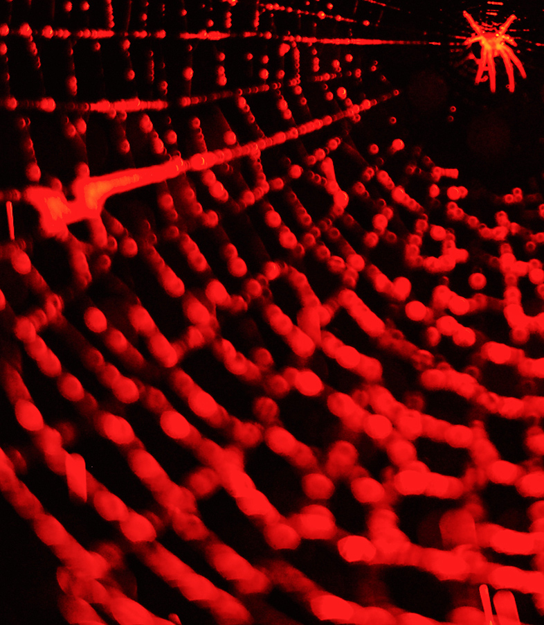
- Redspidered - crop, 1 stobe
with red gel & real rain.
- Alpornis metallica, Nil crop,
levels & contrast
- Delta force, cropped,
brightness, contrast, level
adjustments.
- Sky fall, adjustment to exposure
and saturation, contrast.
- Wall Arted, Cropped, bi colour
filter in post, contrast and
brightness adjustments.
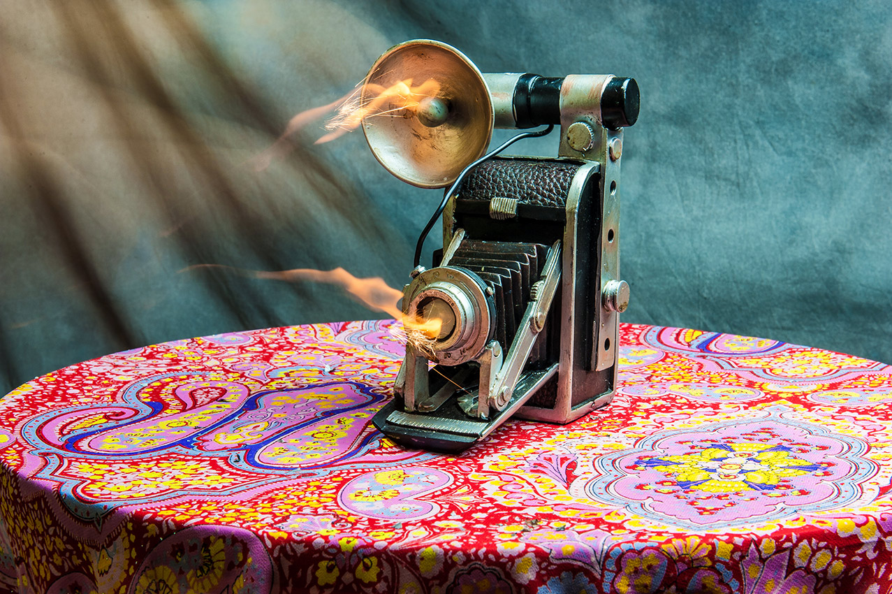
- Vintage, nil crop, long exposure,
flames / sparks the whole
business. Levels, contrast -
Saturation boost.
- Keyboarder, crop, levels &
contrast adjustment, some
vignette to top added for
balancing composition.
- Reefs, slight crop, contrast &
saturation boost
- Bloodstone, HDR exposed for
colour, crop and contrast
adjustment
| March 2013 Topic: "Colour" |
| "Jetty" |
|
| NEXT MONTH TOPIC: Reflection |
| Overall with weighting 8.55/10 |
Martin's Pick - score and comments: "Jetty"
Two absolute standouts for me this month.... One which may surprise you, and the one which snared the win out of
the jaws of the rubbish bin. This shot has brought the subject to life and given it a new celebrity - much like these
talent shows on TV.
Other shots in order of merit:
Other shots not up to your par....
Two absolute standouts for me this month.... One which may surprise you, and the one which snared the win out of
the jaws of the rubbish bin. This shot has brought the subject to life and given it a new celebrity - much like these
talent shows on TV.
- Jetty is an excellent example of an HDR correctly cooked, plated nicely and garnished with fresh zest. I am
guessing a 3 shot 0.3 bracket here. No sign of water lag, and no discernible halo. I would have just have liked
to have seen the whole ladder at right, or not at all. Good good job. No deductions..... We need a new Eval
Sheet Braaaaaz.
Other shots in order of merit:
- Alpornis-Metallica – Probably the Peoples Choice, and for good reason. Nice lens work, top exposure,
sharpy sharp. Matt Karma would be proud.
- Vintage - Yup. Could have been the gong taker. Great subject and cool idea. Just a few things that detract
for mine. Wayward spark below lens, non-uniform background, white balance looks a little coolish (tablecloth),
black thingy on tablecloth. Likey though.
- Redspidered - Just bloody good. Yup better than the other. Print, and hang in toilet or some other place
where it could be stared at.
- Wall Arted - Dunno about this. A quick glance it is very pleasing, second glance it falls from grace. Maybe a
bit of cleanup would have done some magic - AC register, light switches, dodge to LH chair?
- Delta Force - Great title. Difficult capture. Nice result.
Other shots not up to your par....
| ____________________________________________________________________________________________________ |
| "Wall-arted" |
| _________________________________________________________________________________________ |
| Other images Sean submitted, click to enlarge |
| "Foils" |
|
| Overall with weighting 8.73/10 |
Sean's Pick - score and comments: "Rouge"
Ok well presently impressed with the quantity colour filling my eyes from your subs, I also like the variety of
experimentation in this lot.
Ok down to business let me say three of your images in thumbnail view grab and hold my attention they are Rouge,
Foils and Abrasion and I will play them off each other as follows.
Foils I think would have been my pick, I am still not sure what the background is but the fact the focus is not bang
on it cannot be my first pick. Nice concept and reflection used in the composition.
So then this brings me down to Abrasion which is nice and sharp throughout the focal plane and you have evoked
some concern from me for the tree. I like it – is it too saturated – probably.
Now looking at Rouge (confused with the title?) I feel this one must get it. The part print on the mug IMO off
balances it more than needed, but is it sharp – Yes, Colour contrast nicely against black background, crop work
pretty good too. Use of flash – bang on exposure so Hey I am giving the Gong to Rouge mate. Good work.
Other photo credits in order of merit:
- Scorch – like the split spectrum effect that you have caught well here, I can make out the intent but perhaps
some life is needed (like maybe the actual flames to get me going?)
- Prune, not bad but hurts my eyes – to much colour pushing.
- Pasture – the linear composition and pallet doesn’t work for me, grubby sky needs to go.
- Bling – maybe flying through the air would have my interest.
| _________________________________________________________________________________________________________ |
| ___________________________________________________________________________________________________________ |
| Other images Martin submitted, click to enlarge |
| "Vintage" |
Martin's photo notes:
Waiting for yours so I could plagiarise as usual. Surrounded
by colours, but craving colour.....
Image notes -
Waiting for yours so I could plagiarise as usual. Surrounded
by colours, but craving colour.....
Image notes -
- Abrasion - HDR, cropped, curves
- Bling - Long exposure, cropped, sharpened
- Foils - Cropped, colour temperature
- Pasture - Cropped, curves
- Prune - Nil
- Rouge - Cropped
- Scorch - Cropped, saturation, curves
| "Rouge" |
| "Skyfall" |
| "Alpornis metallica." |
| "Delta force." |
| "Luftwaffe" |

|

| "Scorch" |
| "Redspidered" |
| "Prune" |
| "Bling" |
| "Abrasion |
| "Pasture" |


| "Keyboarder" |
| "Reefs" |
| "Bloodstone" |
| Ok I didn't weight the crop either! |