


Sean's Pick - score and comments: "Guilty"
Ok Eval time, out of your little swag this month I could see – like me, you were pushing to find the topic meaning whilst trying to maintain
enthusiasm along the way.
As you mentioned – your submissions were pulled from 150 shots and you found these ones interesting but unsure if they hit the mark. Who
came up with this topic anyway?
One thing I have noticed becoming a trend with your shots is the cropping? Are you deliberately over shooting your capture to post process
them better on a bigger screen? I try to avoid the need to crop when I frame – for one the points deducted in the spread sheet is good
enough reason.
Mate I really think the one that is the most suitable personally is your image “Guilty” as it is better composed and sort of comes together the
nicest.
You can almost feel how soft the furs are and the textural changes work too along with the soft lighting. Although not fantastic it is pleasing
to look at.
Other image notes in order of merit:
Martin's Submissions
Sean's Submissions
| June 2010 Topic: Still life set by Sean |
This work is by Sean Reason. It is licenced under a Creative Commons Licence
| "Beauty is in the eye of the beholder" |
| "Jessie" |
| "Reused" |
Sean's photo notes
Ridey-O-man, here are my lot for the month
Sort of was a bit flat this month
for inspiration after finding HDR hey.
Still life - well these shots spoke the loudest
whilst they were still..
All have level, contrast adjustments,
Oh well give my your shots now you
bastidido! & the topic
Luv to the gang.
Seano.
Ridey-O-man, here are my lot for the month
Sort of was a bit flat this month
for inspiration after finding HDR hey.
Still life - well these shots spoke the loudest
whilst they were still..
All have level, contrast adjustments,
- Seated is also cropped + Desat
- Bird wing is also de saturated.
Oh well give my your shots now you
bastidido! & the topic
Luv to the gang.
Seano.
| "Imposter" |
Martin's photo notes
Braaaaaz;
Heres my swag for June. Must say this topic had me struggling, and I am not
sure all of my images really fit into the still life genre. Out of about 150 images
that I had in the bag, these 9 are the ones that I consider to be “interesting” –
which is what I based my selection on to meet the topic.
All images cropped.
Levels to
Shine cloned out of
I’ll have your eval done directly and hit you with another challenging topic.
Braaaaaz;
Heres my swag for June. Must say this topic had me struggling, and I am not
sure all of my images really fit into the still life genre. Out of about 150 images
that I had in the bag, these 9 are the ones that I consider to be “interesting” –
which is what I based my selection on to meet the topic.
All images cropped.
Levels to
- G and T
- Gastronomic
- Guilty
- Jessie
Shine cloned out of
- Gastronomic
I’ll have your eval done directly and hit you with another challenging topic.
| "Seated" |
| "Ant Hill" |
| "Skip" |
| "Gastronomic" |
| "Guilty" |
| "G and T" |
| "Sandy" |
| "Self seeded" |
| "Tickets" |
| "She-Oak." |
| "Birdwing" |
|
Overall with weighting 7.55/ 10
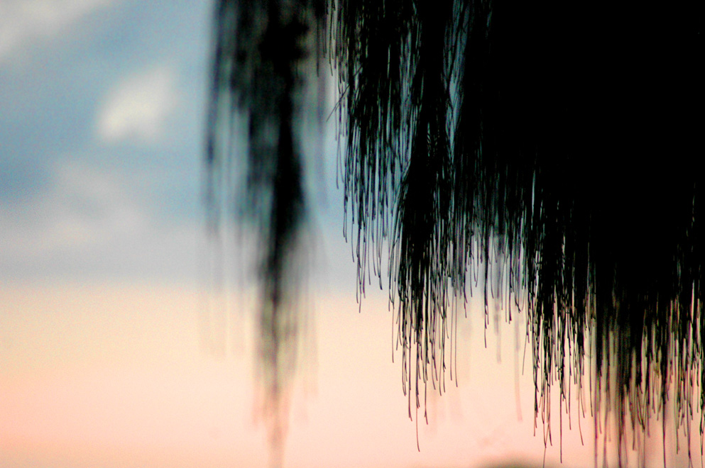
Martin's Pick - score and comments: "Bird wing"
I chose this shot after quite some deliberation. I guess out of all the shots it is the "artsy" est, and I think still life should artistic,
inanimate and easy on the eye. This shot is all three. Great depth of field and nice composition makes the subject believable and
natural. Not too much detail to give the mystery away also works well. Monochrome also suits this shot. Like it.
Other image notes in order of merit:
I do think we have another crack at this topic later in the year maybe...
I chose this shot after quite some deliberation. I guess out of all the shots it is the "artsy" est, and I think still life should artistic,
inanimate and easy on the eye. This shot is all three. Great depth of field and nice composition makes the subject believable and
natural. Not too much detail to give the mystery away also works well. Monochrome also suits this shot. Like it.
Other image notes in order of merit:
- She-Oak: Great textures, and good black silhouette. I would like to have seen the bottom cropped to remove the dark hump
bottom right though.
- Ant-hill: Love the symmetry and contrast, nice DOF. Not nearly sharp enough however.
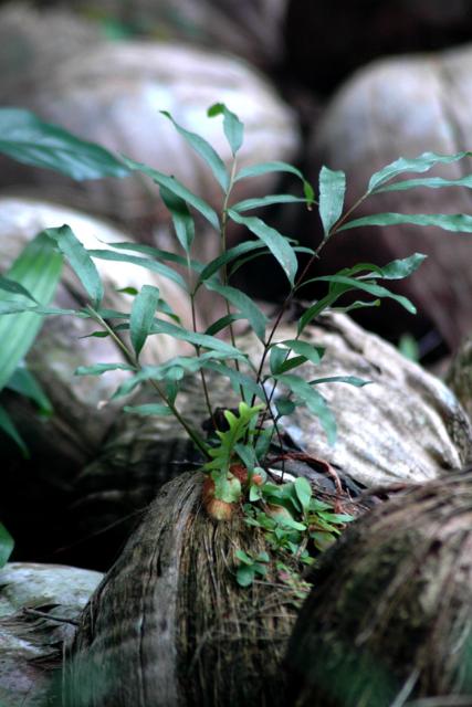
- Selfseeded: Great capture, beautiful colour and sharp where it matters. I just can't get a feeling of art from it.... I nearly chose
this when I first started the evaluation.
- Sandy: Great shapes and nice colours. If you had your pluggers on then you should have thrown one into the mix to boost his
shots appeal.
- Tickets: Bugger, great idea, but super not sharp enough.
- Seated: Nup, don't like it..... I wouldn't sit on that bench.
I do think we have another crack at this topic later in the year maybe...
|
Overall with weighting 7.83/ 10
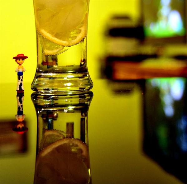
- Jessie, - This shot could have been brilliant only if you chopped out the right distracting half and moved your position so the reflected bench was clean of anything but the subjects.
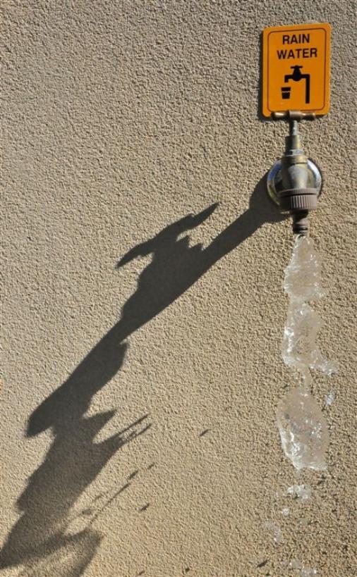
- Reused, although find it hard to draw the connection with the topic - I do think this one stimulates you and me simply because of what you are doing here with the shadow. Right
time of day, Good wall texture – but needs to really be the accompanying photo for a sustainability book?
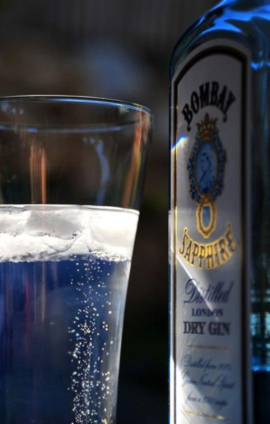
- G and T, yep another nice shot – more like a product photography image though? Shallow DOF – perhaps too shallow? I like the blueness coming through of the juniper berries!
- Imposter, this image is not bad either – a mix of hard elements with the softness of the grass just coming through as garnish? A little boring but with the light rays works for me.
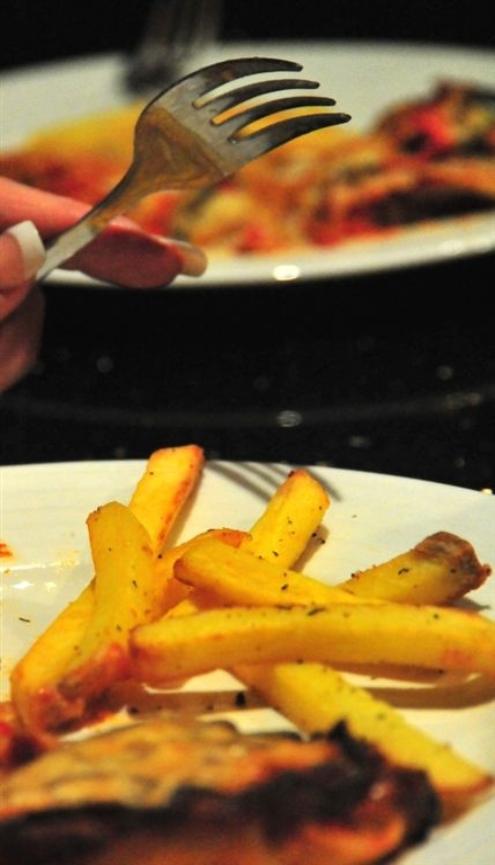
- Gastronomic? Not sure what why this image was submitted but nice to see your growing your nails.
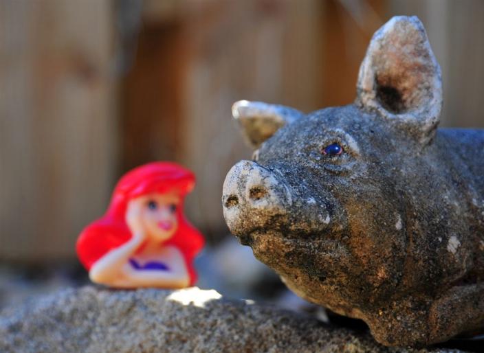
- Beauty is in the eye of the beholder, big name – disturbing photo (that pig’s eye is too freaky)
- Skip, NFQ.....

Next month: MOTION
Set by Martin
Set by Martin