


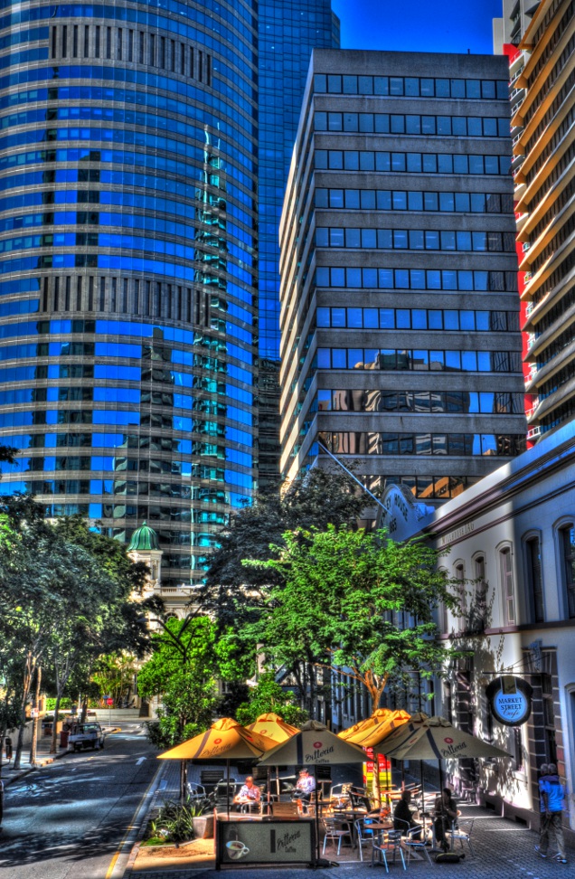
Martins Pick - score and comments: Bedford
A very difficult choice this month as I was spoilt with 5 great shots and 5 very good shots.... Yes 11 were submitted, more on that later.
Out of the 5 great shots I chose the shot that I could just keep looking at and never get sick of it. And that shot is:
Bedford
When I first looked at the shots I never really gave this a second glance. I was more interested to see images that would have presented the greatest
challenge to nail, and in my opinion this image screams simple... Almost staged. It was later that I found myself continually referring other images back to
it for technical calibration if you like. The HDR is spot on with only a hint of over exxy under the cab. Composition is terrific with the lower point of view
looking through the glass at the background - maybe just a looser crop to get more of the interesting location?? Lighting plays well on the dirty
windscreen and bonnet badge. The vehicle really has a sense of place, it seems it is at rest. The right mix of HDR graininess and smooth detail also
won me over. Top notch!!
Other image notes in order of merit:
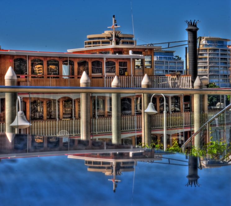
- Red Beret: Nice capture of North Queensland iconic architecture. The railway crossing turns it into a great shot. DOF, lighting and vibrance of
colour plays very well. I actually love the "busy" ness of it all. Makes me bloody thirsty. - Vinnes (sic): Great subject choice here. Remarkable detail in both fore / background. I may have tried to avoid the industrial bin at left. But that
would have screwed up your point of view, or even clone it out. I bet a print would come up a treat at full res. - Tedesco: In my view probably the most challenging to get the right exposure. The image is a bees dick off centre and is really screwing with my
symmetry as it appears as if you were trying to get it bang on. The lighting inside is terrific and the corrugated iron springs off the screen. Nice. - Station of Old: Great grab of a 70s bowser. But it was the weatherboards that made it a great shot for mine. I can almost feel them.
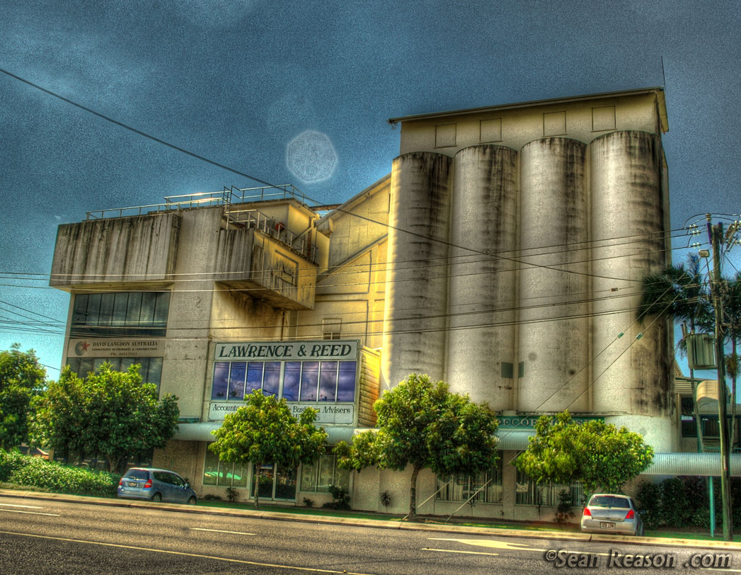
- Sugar Silo 1: I really like the shapes here and the roof tonal change. I am not so fuzzy about the crop. Also the grass dos'nt look real.
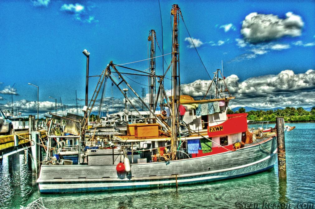
- Wharfy: Don't really like the point of view, but still a good HDR shot. Love the detail on the net.
- Boat 1: It's a nice shot, but given the position of the sun I think it would have presented well in standard format.
- Hankook: Interesting..... Not sure about the point of view, but the detail is tack sharp. It appears to be a little "cool".
- Tank: A nice shot but has little interest. Textures look good.
- Brewery: Don't really like it.... It looks as if you were hunting for that 11th image.
Sean's Submissions
Martin's Submissions
| May 2010 Topic: High Dynamic Range Photography set by Martin |
| This work is by Sean Reason. It is licenced under a Creative Commons Licence |

| "Sugar-Silo" |
| "Vinnes" |
| "Wharfy" |
Martin's photo notes
Braaaz;
Very interesting this month. I tried to get some
variety after being blasted for April’s
submissions.
Some notes:
All images shot with 5 exposures +/- 0.7EV
All images processed / enhanced
All images cropped.
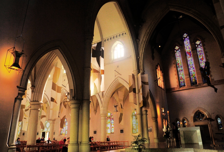
St Johns – Some burning to leadlight windows.
Braaaz;
Very interesting this month. I tried to get some
variety after being blasted for April’s
submissions.
Some notes:
All images shot with 5 exposures +/- 0.7EV
All images processed / enhanced
All images cropped.
St Johns – Some burning to leadlight windows.
| "Tank" |
Sean's photo notes
Nice going this month Bras
Can wait to go through them in detail
Here are my lot m8
All taken over 5 exposures – manually
changed each time to my frustration +/-
1EV– (D700 here I come!)
No cropping apart from image "Tank"
All images processed & enhanced
Signature put in for good measure.
Good work again bras – now go have a
beer!
Luv to the gang too.
Seano
| "Aussie Flag" |
| "St Johns" |
| "Old brewery" |
| "Board walk" |
| "Storey Time" |
| "Steamer" |
| "Steel works" |
| "Hankook" |
| "Boat1" |
| "Red-Beret" |
| "Bedford" |
| "Station of old" |


| "Vivid" |
| "In the garden" |
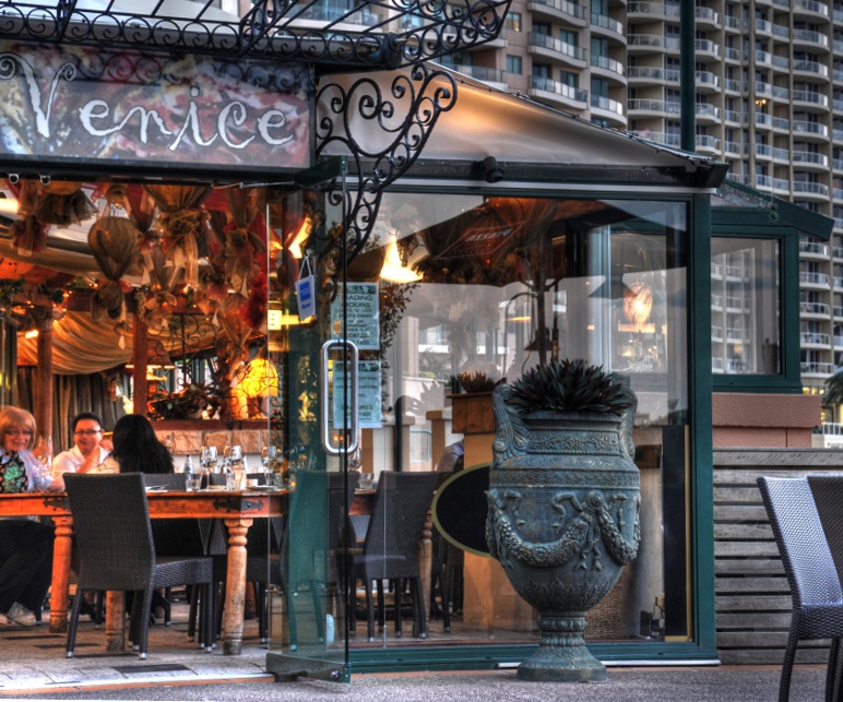
| "Venice" |
| "Bowled Over" |
| "Coffee" |
| "Servo" |
|
Overall with weighting 8.88/ 10
Sean's Pick - score and comments: Coffee
A Ridey O Man –
Firstly well done in the variety of subjects this month – it is evident that you to are
also keen on this type of photography & it shows through in every image. I was a little
surprised to read you cropped every image.
Your approach with the processing is handled more softly than I and probably in the
eyes of the HDR critic more in line of the standard although saying that I do prefer
exploring the grains and textures with the light available and slapping your face with it.
My selection was also difficult given the number of shots also 11!
Coffee
I really think the composition – DOF & colours have been handled perfectly in this
image with the eyes scanning into all nooks and crannies. I think getting the shop
name and positioning yourself at the tree height really expresses the quaintness of
that little barista in a busy city. I hope you had a coffee there or at least email them
this image..The sequence of shots also expresses the subtle human movement which
also adds to image.
Other image notes in order of my merit:
- Vivid: I particularly like this shot but I am not sure exactly if it is due to my daily
profession with structures or the technical way in which you have composed
and exposed this shot. A very interesting balance of nature and the built
environment. - Steamer: Another nice one to look at and one I am sure you were happy to get
at the time. Its a pity that the units to the rear interfere with the steam boat and
perhaps a wider aperture would have made them less evident if unavoidable. - Storey Time: Well composed, nice use of light – perhaps some further
dodging to the centre of the bridge’s underside would of expressed the centre
of interest – as I find my eyes drawn past and through to the cliff faces beyond
which look great! - Caltex: This sort of exposure for some reason really work for me in this form, I
enjoy the grain, colour and realism – dodging the cloud midtones would have
brightened up the day though. - In the garden: Yep similar image to Coffee when seen side by side – and
within image some HDR work seen but elsewhere not needed. The colour of
the rheo leaf does complement this image just not sure again what is the main
feature? The sun rays look superb.. - Boardwork: This reminds me of spot in Kowloon bay – I like the edge
distortion to the sky scrapers on a centre line of symmetry. The buildings do
come to life in the right light and is a good image to use to remember what light
value works. - Venice: Shadows nicely exposed – probably too much DOF for my liking and
cropping a bit of a mystery. - Aussie Flag: More contrast needed here to drag out the subject, sun works
well in the top corner and yep I can see where you were headed. I thought the
D700 has a self cleaning CCD – I hope that’s not sand!! - St Johns: Well this shot is down here because you didnt get the full tonal
range which is the topic? I do like your angle though – go back and do this
again and insure you get the shadows! - Bowled over: A bit too sloppy when compared to your other shots and
surprised a better image didnt make it through from this venue.. Rackem up!
|
Overall with weighting 8.48/ 10