


| March 2012 Topic: "Commercial Photography" |
| "Worcestershire" |
|
| NEXT MONTH SUBJECT: Wide angle |
| Overall with weighting 7.58 / 10 |
Sean's Pick - score and comments: "Worcestershire"
Not a bad swag this month mate, I see plenty of colour punch and something of a theme running through some
of your lot. I see commercial photography as being the same as product photography where you are marketing
something as you state.
So here we go! Looking at your subs - I am most impressed with the post effort you have gone to with the
submission “Worcestershire” the tile effect here seems to work ok and yeah I recall the kick and even salivate a
little with your catch cry title “Never Dull” Good illumination of the colour if not pushing into the surreal with
interesting refections and border.
Other images in order of merit:
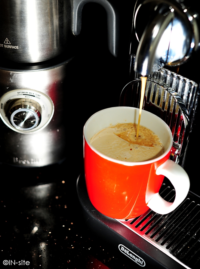
- Crema, Nice focus where it counts, bold contrast too. I have seen this machine used in another
submission which pisses me a bit.. But hey it still is in second place.
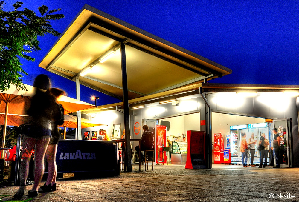
- TVS, There is some interesting thing going on from this advantage point, levels, angles, colours but
where is the company name? If a company then where are the people? Why so much perspective
distortion ?
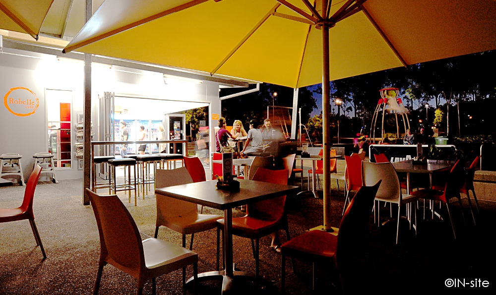
- Cafe, I like the advantage point, the nice arses in the foreground too (or at least from what I can tell) I
see a style or trend in the way you are processing these night shots. I must say I am not that much of a
fan of it though. The reason is the lack of dynamic range and the extreme colours hurt my retinas a little
too much.
- Grand Chancellor, You know if you sent me pictures of buildings I will compare them to the way I see
things being right – this image is over exposed on the building, colours are pushed again too hard and
without perspective control well its distorted far from the things that satisfy me with such a subjects.
- Robelle, nup dont like – what about getting that sign in to the left, extreme colours & no dynamic range –
oh well I guess you don’t like it when I crop a little too far to the left or right you bastid..
- Design Den, Nup mostly due to the above reason.
| "Robelle" |
| "Design Den" |
Martin's photo notes:
Hey Braaaaaz.... First as usual.
Here's my stash for March. I wish I had a
bucket full of SBs this month.
Notes:
Crema - Cropped, curves, dodging inside cup
Grand Chancellor - Cropped, contrast,
burned vignette
Design Den - HDR,Cropped, colours
TVS - HDR, Cropped, curves, dodging to
artwork
Cafe - HDR, Cropped, curves, sharpened
Robelle - Cropped, Curves, contrast
Worcestershire - Colours, sharpened, tiled
Topic for April - Wiiiiiide Angle. NFQ
| _________________________________________________________________________________________________________ |
| "Cafe" |

| ___________________________________________________________________________________________________________ |
| "Grand Chancellor" |
| "TVS" |

| Other images Martin submitted, click to enlarge |
| "Construction timelapse" |
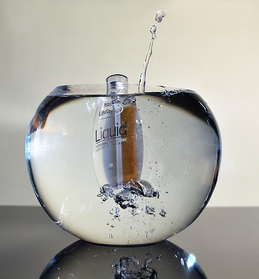
| "Liquid" |
| "Fossil" |
|
| Overall with weighting 7.55 / 10 |
Martin;s Pick - score and comments: "Absolut Berri Acai"
My rationale for the hitting the topic was; whether I would want to buy this object, or go to this place, or use
this item, etc etc.
There was no doubt in my mind this month for first place. I would certainly be very much more likely to buy
this product after seeing this image, hence Absolut Berri Acai takes the gong - and by quite a few lengths.
The colours are terrific, light is very nice, composition nearly nailed (part berry visible bottom right)..... But I
gotta say WTF did'nt you clone away the yucky orange stuff (reflection?) in the liquid since you had already
cloned other parts of the image? Did I mention nice DOF, giving the image some sense of movement.
Other images in order of merit:
I was sure I would have seen some of your interiors??? Or are you too bloody stuck up to send me your
paid shoots. Arshooole.
My rationale for the hitting the topic was; whether I would want to buy this object, or go to this place, or use
this item, etc etc.
There was no doubt in my mind this month for first place. I would certainly be very much more likely to buy
this product after seeing this image, hence Absolut Berri Acai takes the gong - and by quite a few lengths.
The colours are terrific, light is very nice, composition nearly nailed (part berry visible bottom right)..... But I
gotta say WTF did'nt you clone away the yucky orange stuff (reflection?) in the liquid since you had already
cloned other parts of the image? Did I mention nice DOF, giving the image some sense of movement.
Other images in order of merit:
- Liquid: Really nice lighting on the subject, but is somewhat lost in the distracting incised background.
The crop needs to be spot on if you intend to place the subject centrally (RH side looks to be about
30% wider than the LH). Slippery looking shot all the same.
- Timelapse: Yup it's good, I would by your services to put a timelapse together for me. But the
subject has little commercial interest. Maybe some music to sex it up, or even finish the set with some
inhabitants??
- Fossil: Hmmmm. Did you soften this?? I can see you used a very shallow (maybe f4) DOF, but even
the watch hands don't appear tack sharp. Very difficult to light these babies without a lightbox, but I
can see you had a number of illum points. Looks nice - no reflection off glass is a winner. Again, crop
is slightly off centre both horizontally and vertically.
- P Plater: Nup don't get this one..... Liking the hint of a bra strap though.
I was sure I would have seen some of your interiors??? Or are you too bloody stuck up to send me your
paid shoots. Arshooole.
| _________________________________________________________________________________________________________ |
| ___________________________________________________________________________________________________________ |
| Other images Sean submitted, click to enlarge |
| "Crema" |
Sean's photo notes:
Gday Brazz, first as usual
Whew!
Okie dokie photo notes:
Gday Brazz, first as usual
Whew!
Okie dokie photo notes:
- Fossil, Cropped,
desat, levels,
sharpened.
- Liquid, some dodging
of reflections, levels,
contrast added,
cropped.
- P-Plater, Cropped,
some cloning out of a
street light, contrast.
- Absolute Berri Acai,
Cropped some cloning
out of reflection,
contrast boost.
- Timelapse, Something
different, a timelapse
shoot of a recent
project we are putting
together
| "Absolut BerriAcai" |

| "P- Plater" |


|
