Martin's submission notes:
Braaaaaz;
I probably have the record for
shots hitting the shit heap this
month. Had a hit ratio of
about 10:1.
Tried to quirk it up a bit, not
real happy with my bunch...
but hey, I'm first and you can
now plagiarise as usual.
Braaaaaz;
I probably have the record for
shots hitting the shit heap this
month. Had a hit ratio of
about 10:1.
Tried to quirk it up a bit, not
real happy with my bunch...
but hey, I'm first and you can
now plagiarise as usual.
| May 2014 Topic: Multiple Exposure |

|

| _________________________________________________________________________________________________________ |
| ___________________________________________________________________________________________________________ |
| NEXT MONTH TOPIC: Close up! |
Sean's submission notes:
Ok Ok a bit OCD with the
subs, it started with 40 short
cutted then down to this
24!? I was going to then do
a second chop and thought
hey Bandwidth is fast these
days and well more for you
to see the better for me!
Really like the artistic push
in the back with this topic
and felt it got me thinking
about even bigger things i
never got to do..
Oh well take a look and
whittle down if any blow your
goat?
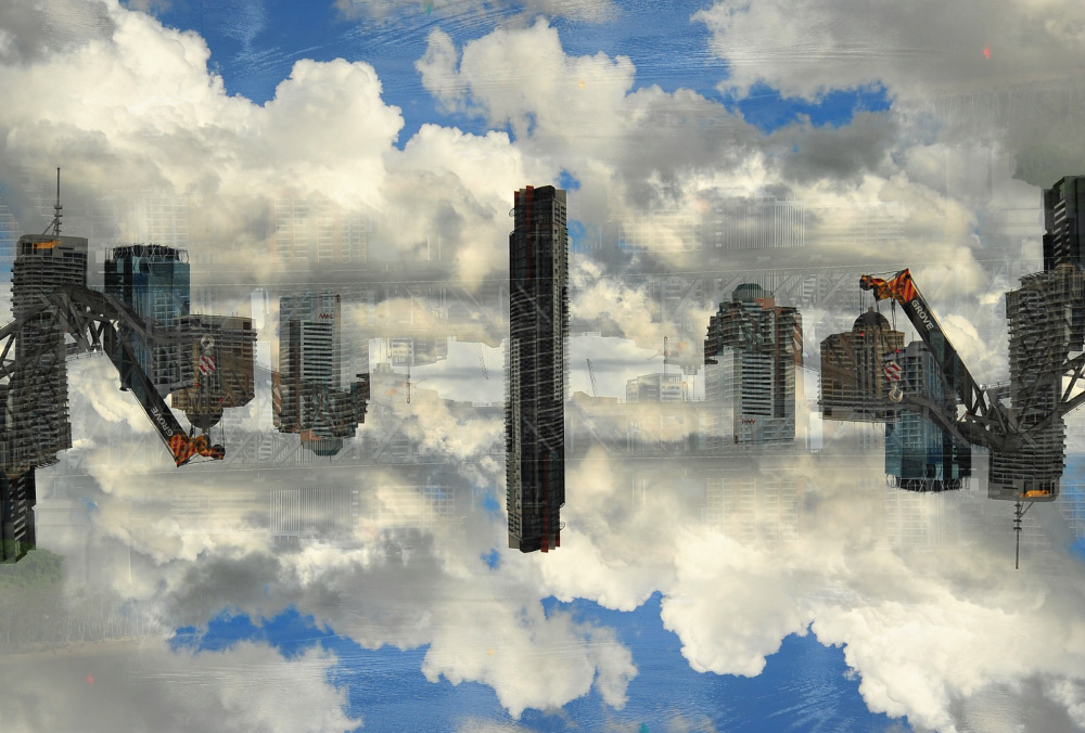
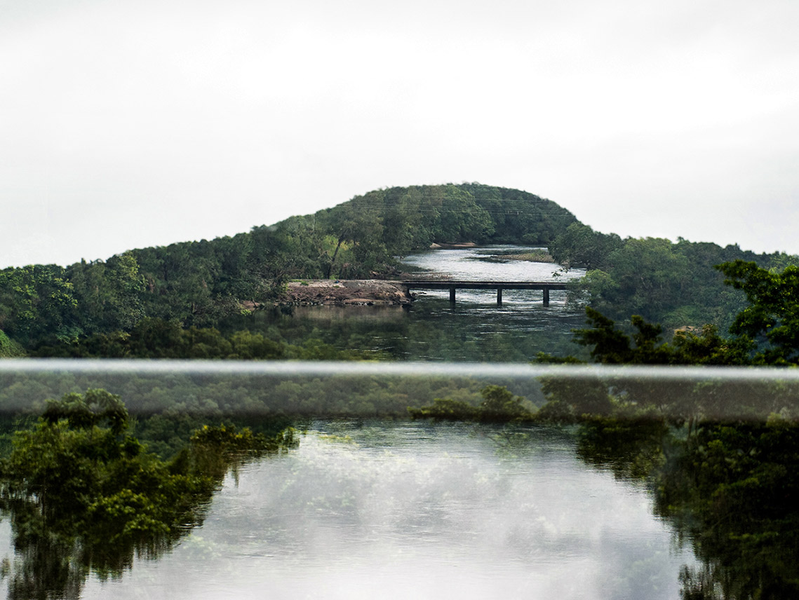
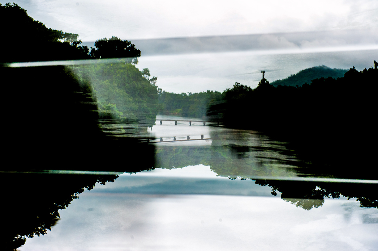
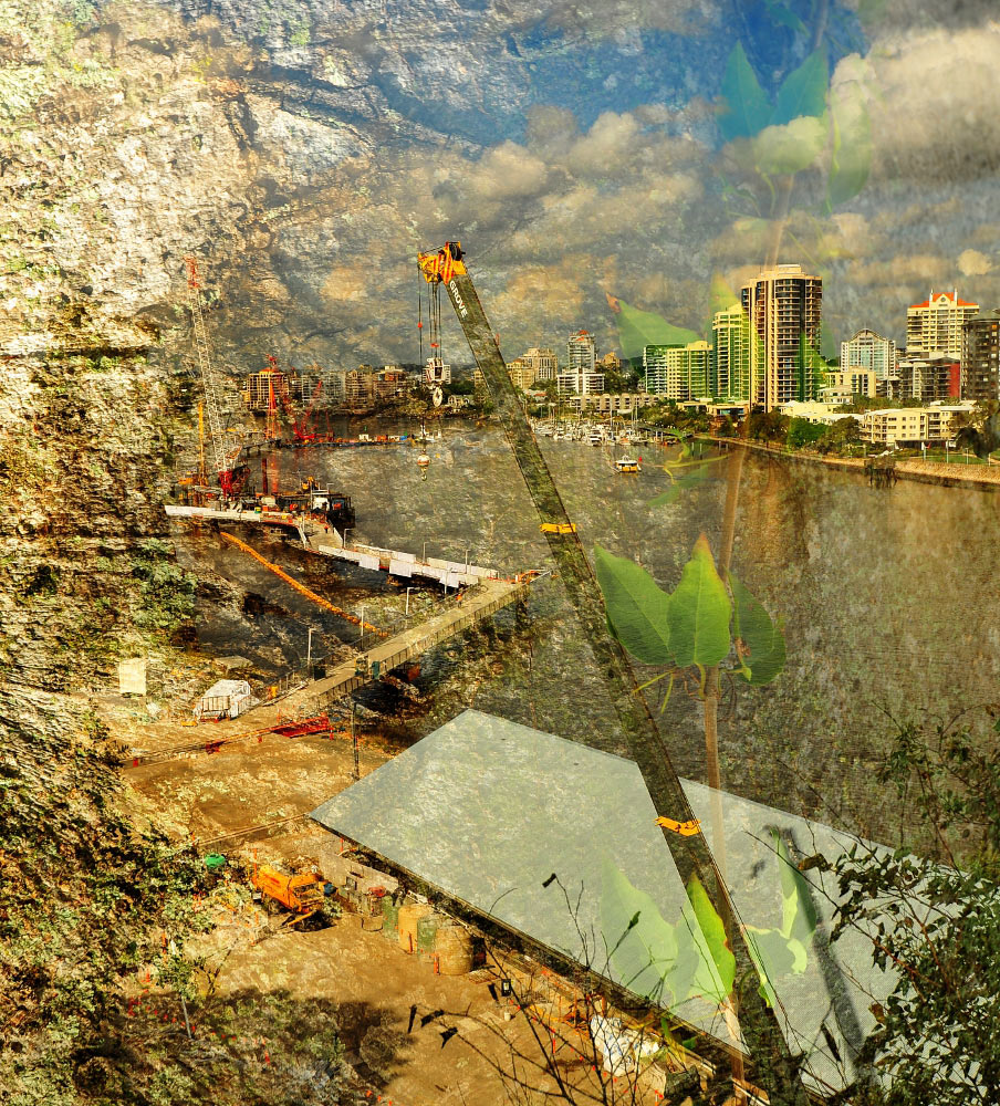
Sean's Pick - and comments: "Reflection"
Not bad subs this month mate, I see you working many options and ideas through and can imagine how many slipped through the cracks.
There are three contenders I feel each a little different but all pleasing to the eye.
First place I have to award to Reflection, This is dreamy balanced image with plenty going on to keep me gazing away at all the detail. I wondered how
many goes it took you to line the central building up with the adequate overlap? I in particular dig the clouds working with the water forming a natural
boarder to the image. Cranes also add interest in a topsy turvey way?
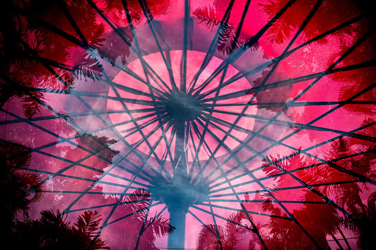
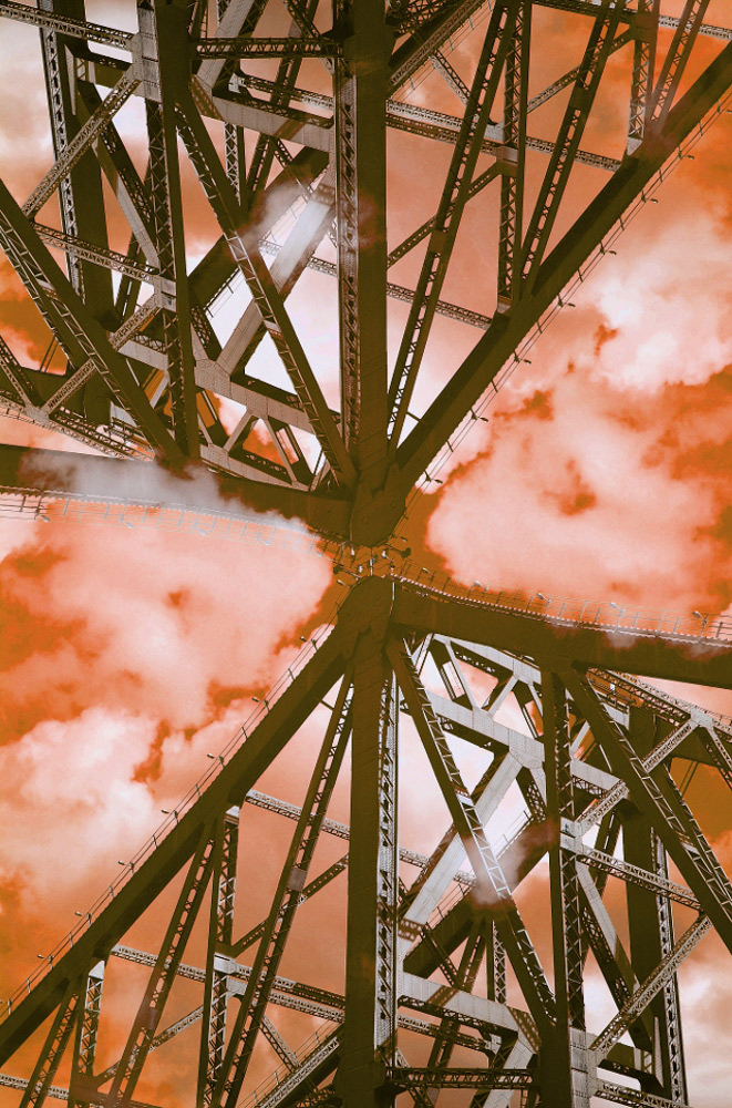
- In second place is Red Steel, double exposure again executed in a symmetrical way pulls me into the focal point in a hypnotic fashion. Don’t mind
the red sky and clouds but not sure why. The addition of a person or a car might have added some interest.
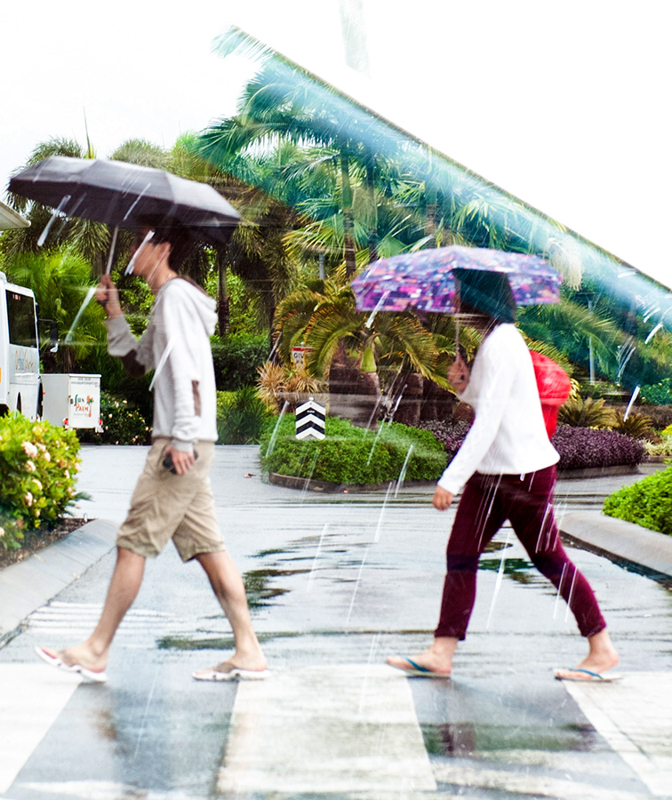
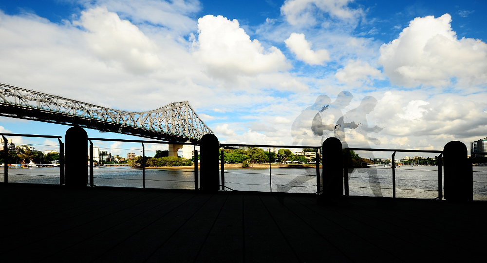
- City Runner, I am liking the concept here and don’t mind the silhouette work to the foreground. The runner is something typical these days of people
(including myself) glued to peripheral devices even when they shouldn’t be.. Would be a good sequence if the runner bounced off a tree though LOL..
The Old Storey bridge sneeks into your image once again – gosh I have seen a fair bit of that bridge through you over the years, feels like we built it..
The angle of the hand rail would have preferred level?
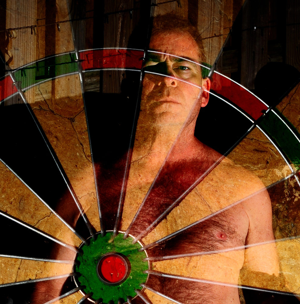
- SelfieTarget, this one could have been nailed with another frame with a dart mid flight going for a Red Bull, Decent eye focus given knowing how the
way the camera handles the multiple exposures feature. Some flash used too? Interesting I used a dart board when scoping shots this month as well.
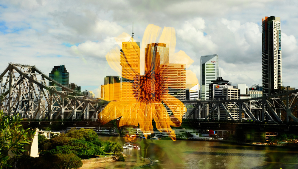
- City Bloom, good old Singapore Daisy centred on the bridge, looks pretty interesting however I think you should have used it like a sun to either the
top right or left to evoke a double meaning. A weed flower smack bang in the centre, although nice exposure – not sure it works much for me.
- Reflection 2 – ok one of the others that you experimented with here, prefer the first one as it lines up better, clouds work better etc etc.
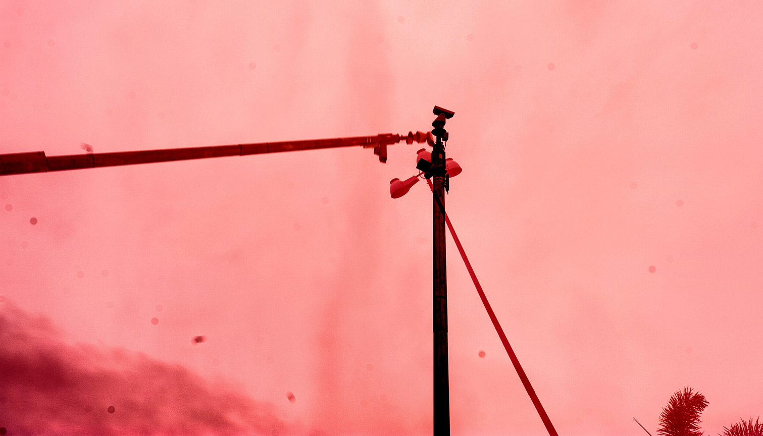
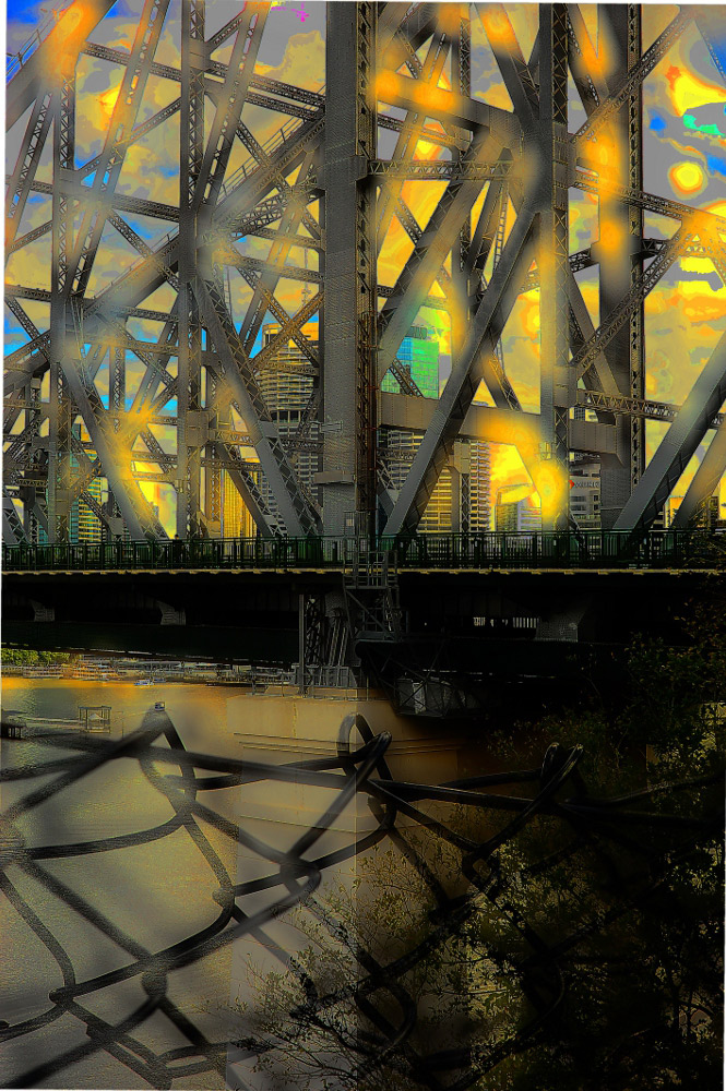
- Armageddon, yep sure looks like hell out there, not sure what effect that is or what it was you photographed but the yellow flares, wire in the
foreground all make my eyes hurt a little.
- Cranage, not loving this shot much – get a bit lost in the wash up.
| ___________________________________________________________________________________________________________ |
| "Connected" |
| "Armageddon" |
| Sean's other submissions - Click to enlarge |
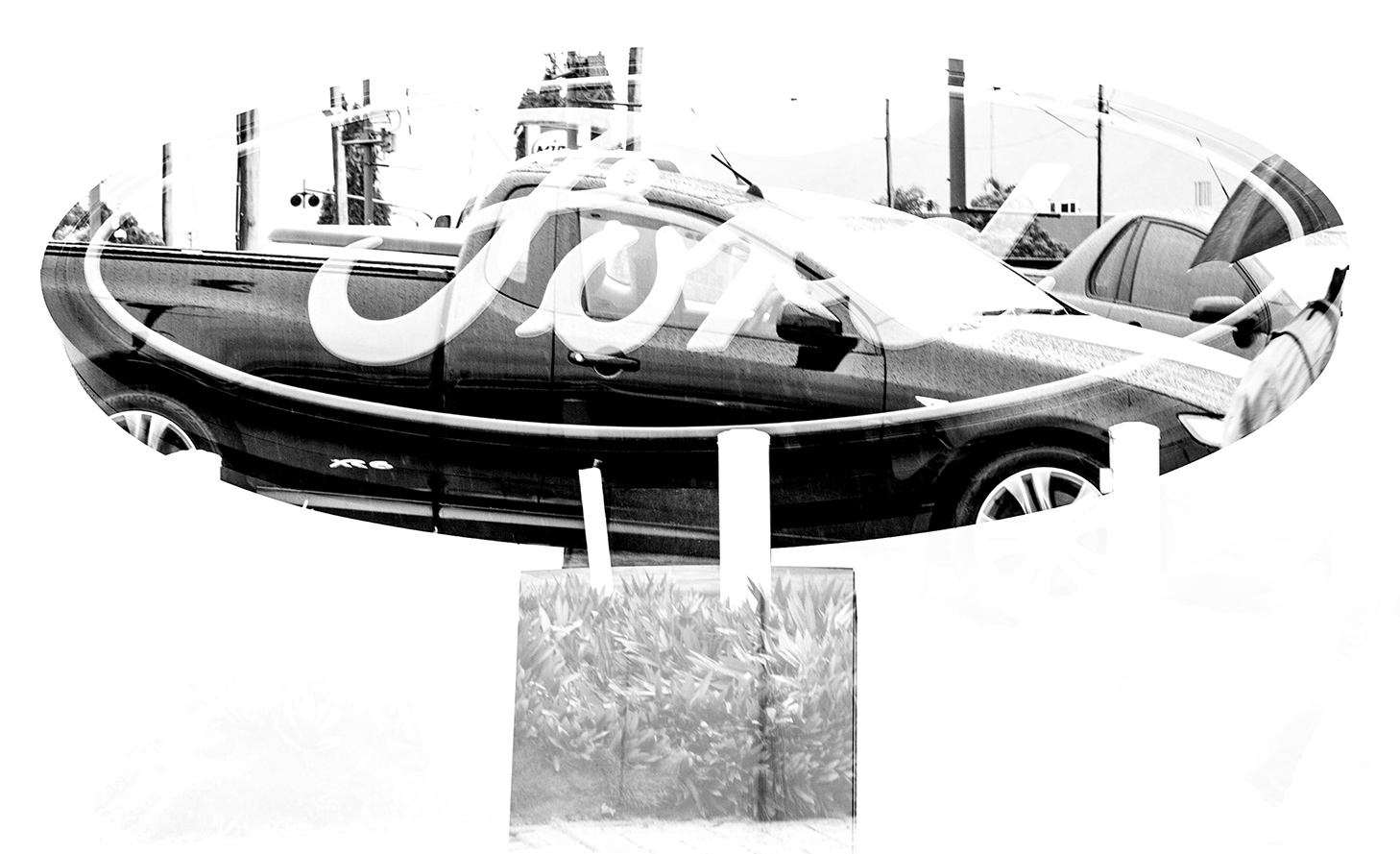
| "Ford-XR6" |
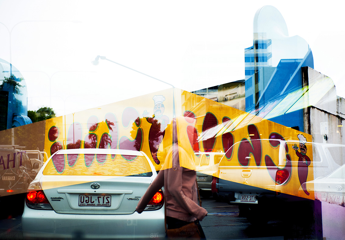
| "City Bloom" |
| "Frame smash" |
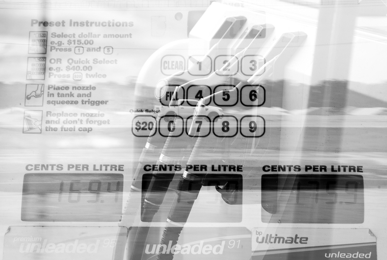
| "At the pump" |
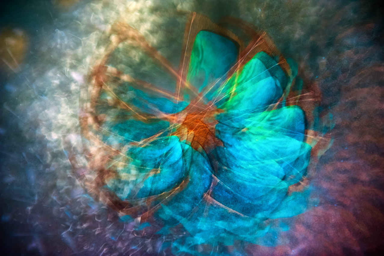
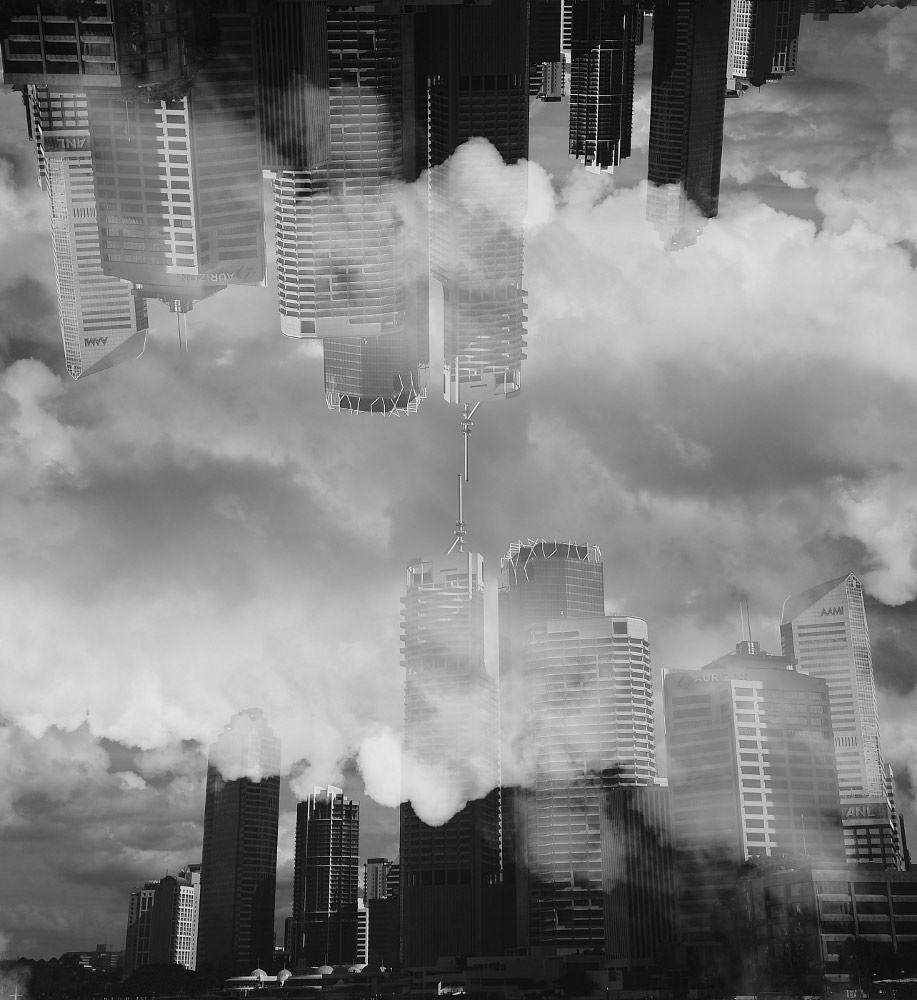
Martin's Pick - and comments: "My Eyes"
Pretty difficult to run a definitive evaluation with this topic.... So many variables. So I really just plucked a few figures to equate to a score of
what I thought this image should get. Two images were in my top list, both arty farty. My Eyes takes it this month. Really just because it is
very pleasing on the eye. The PP is nice, symmetry good, zazzy opalescent colours. VFN
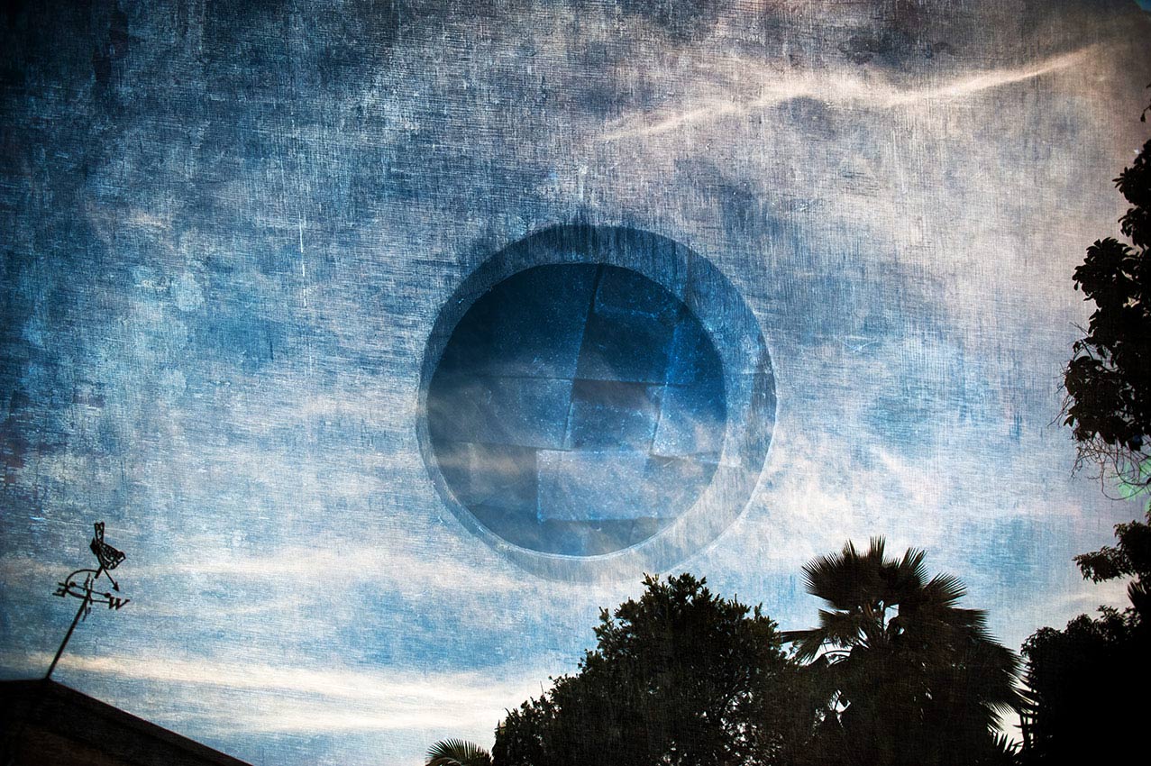
A very close second is Other World. I immediately saw a book cover here. Not sure of the make up of the image - but it worked bloody well.
Other images in order of merit:
I won't bang on with the others. Looks as though you had some fun this month.
Wheres my eval and taster? Lift yo shiiiiteeee.?
Pretty difficult to run a definitive evaluation with this topic.... So many variables. So I really just plucked a few figures to equate to a score of
what I thought this image should get. Two images were in my top list, both arty farty. My Eyes takes it this month. Really just because it is
very pleasing on the eye. The PP is nice, symmetry good, zazzy opalescent colours. VFN
A very close second is Other World. I immediately saw a book cover here. Not sure of the make up of the image - but it worked bloody well.
Other images in order of merit:
- River Contact - This image has me searching through it for answers, like "how da fuck is this one done?" I should'nt be so nosey
and just enjoy the journey. - Mothership - Another well done arty farty.
- Twin Thoughts - Simple well exposed goodness.
- Sun Bouge - Likey, don't lovey. Hmm, I just see many ways this could have been improved maybe. Bet you have a few of this trying
to get it just the way you wanted it.
I won't bang on with the others. Looks as though you had some fun this month.
Wheres my eval and taster? Lift yo shiiiiteeee.?


| ___________________________________________________________________________________________________________ |
Brief
All multiple exposures are to be taken in camera only and not layered in post processing
All multiple exposures are to be taken in camera only and not layered in post processing
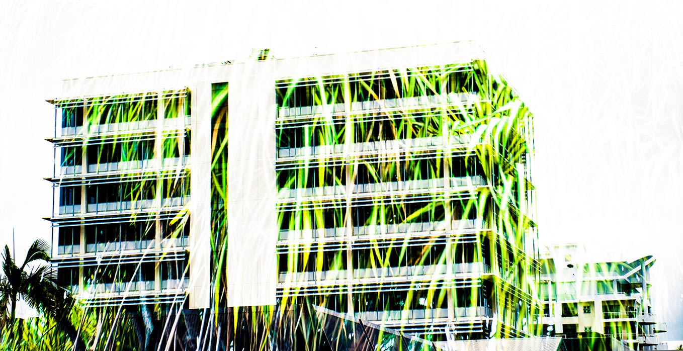
| "Green Buildings" |
| "City Runner" |
| "Cranage" |
| "Selfie Target" |
| Other images Martin submitted - click to enlarge |
| "Red Steel" |
| "Reflection" |
| "Sun Bouge" |
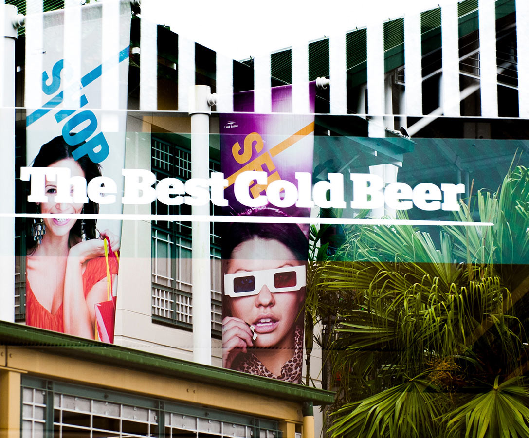
| "Cold Beer" |
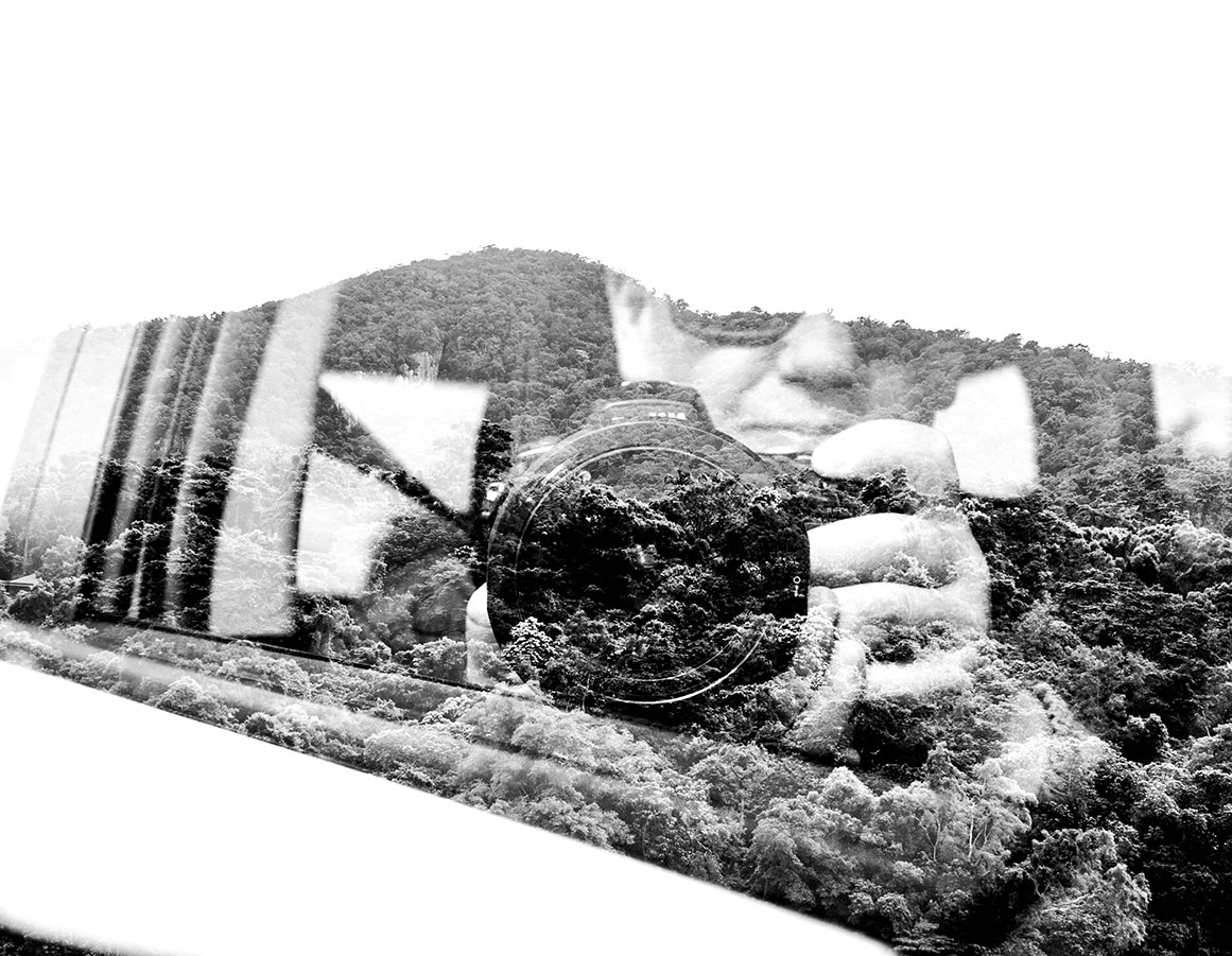
| "Mountain River" |
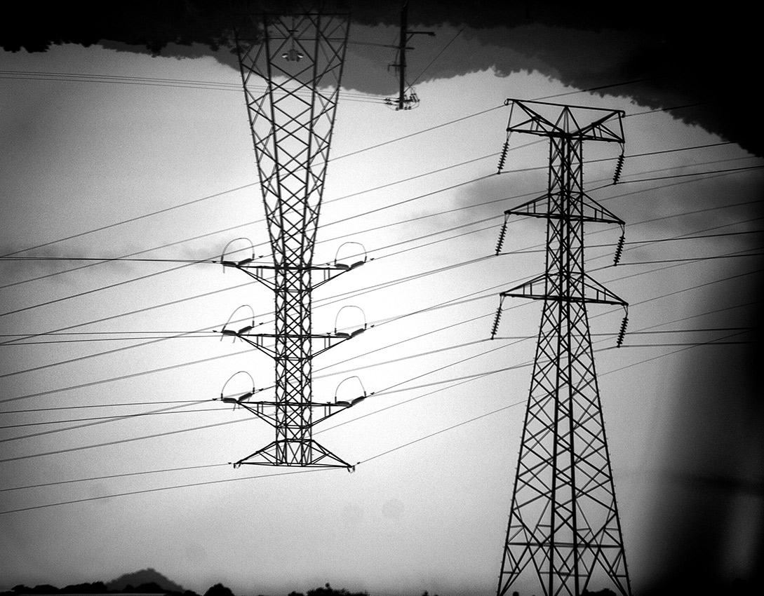
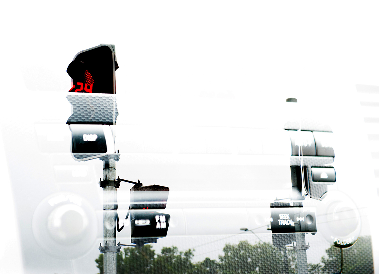
| "Radio lights" |
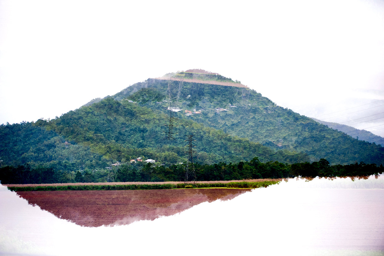
| "Mirrored mountains" |
| "Full Gutters." |
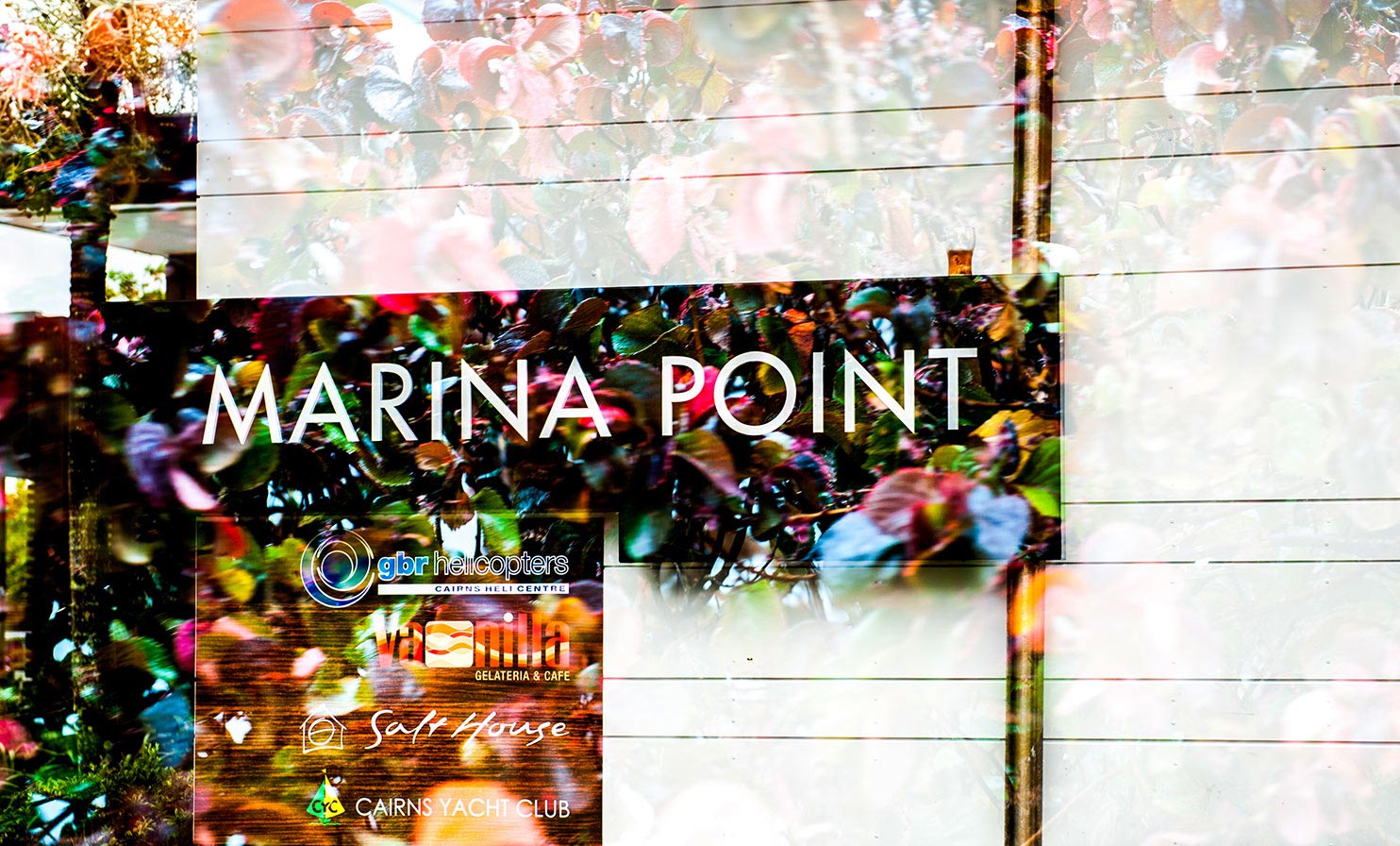
| "Marina Point" |
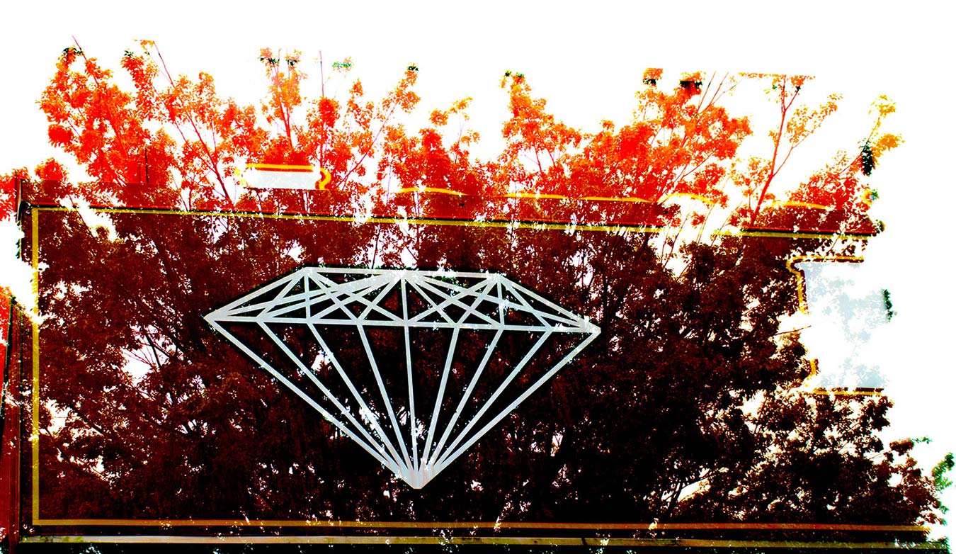
| "Diamond Sunset" |
| "Chilli" |
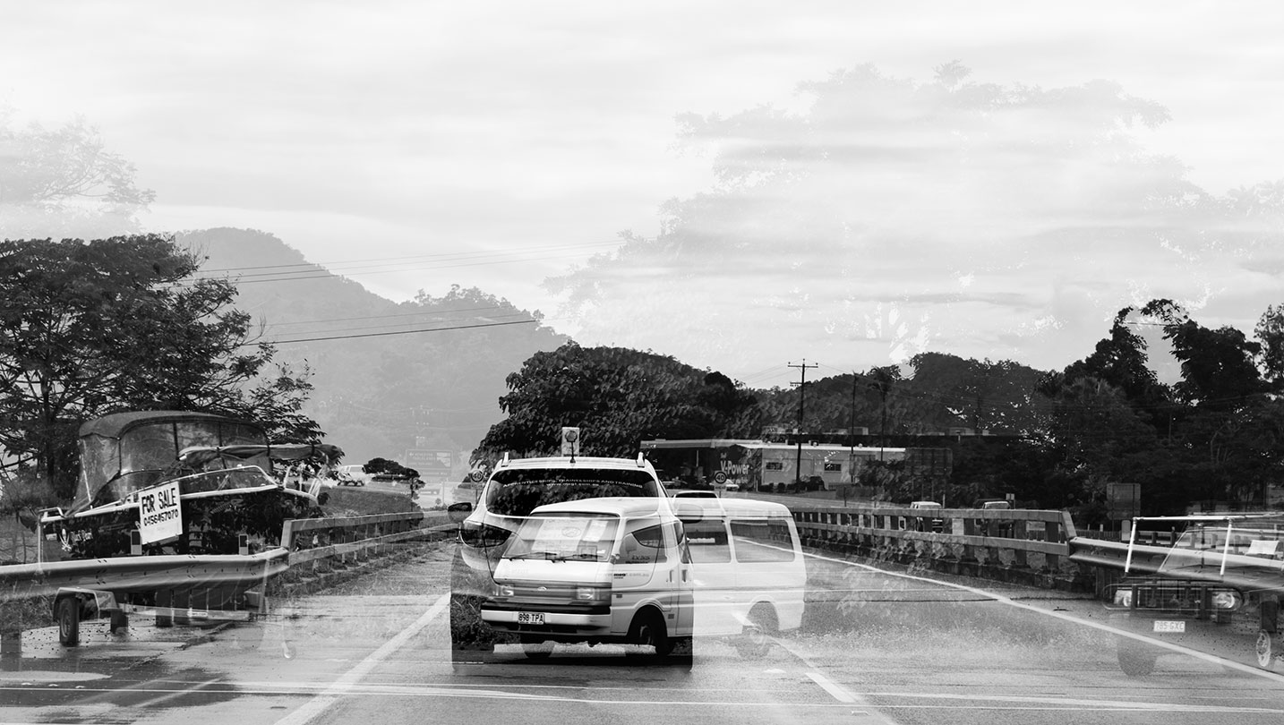
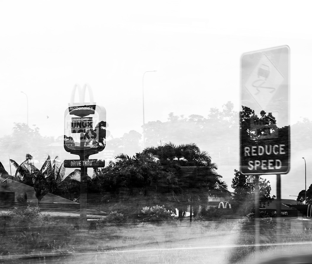
| "Slow down" |
| "Sugar cane hills" |
| "Other World" |
| "Twin-thoughts" |
| "Mothership" |
| "River Contact" |
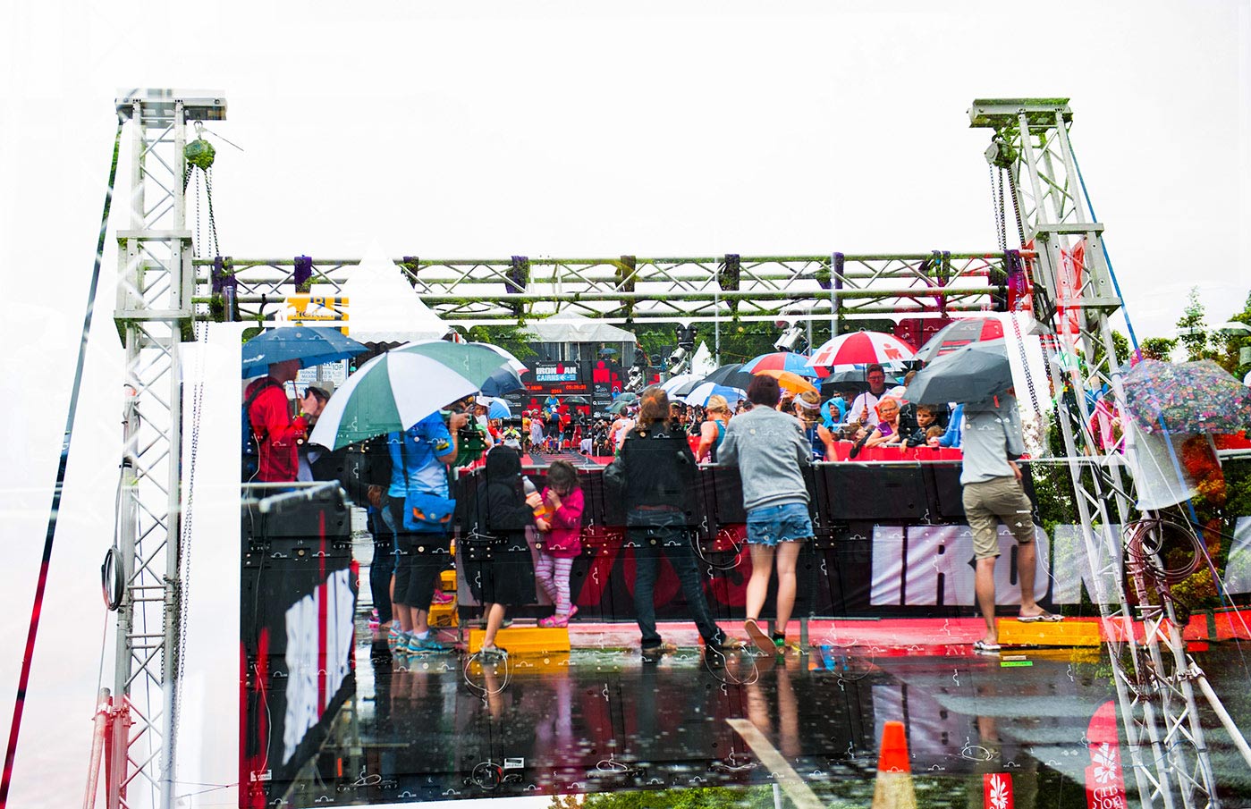
| "Todays triathlon" |
| "War of the Worlds" |
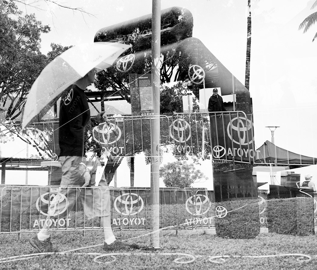
| "Toyota tent" |
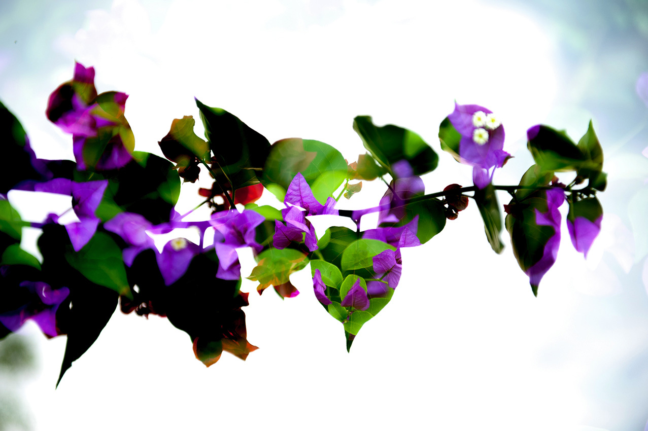
| "My Eyes" |
| "Reflection 2" |