


Martin's Pick - score and comments
Gotta new lens I see..... Or do you??
Dark Leaf was a hands down winner for
me. I dunno Bra.... I just really love this
shot. Light, contrast, composition, it all
works for me. If I have to say anything
negative, then it would be lack of DOF.
Other image notes in order of merit:
Great overall job again Bra. Tell me
about that lens!!!
Gotta new lens I see..... Or do you??
Dark Leaf was a hands down winner for
me. I dunno Bra.... I just really love this
shot. Light, contrast, composition, it all
works for me. If I have to say anything
negative, then it would be lack of DOF.
Other image notes in order of merit:
- Lightme - Just right depth of field.
Punchy image.
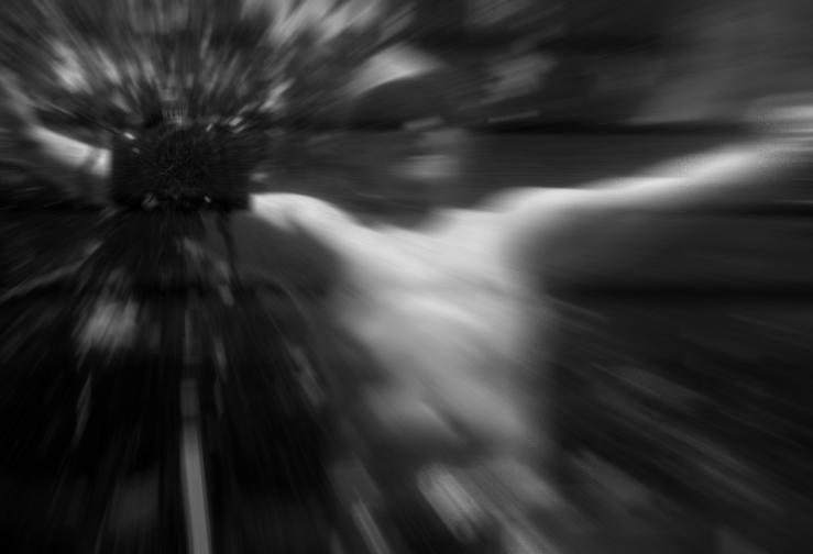
- I time warp - Retracting zoom?? I
like it. Has a real feeling of
movement.
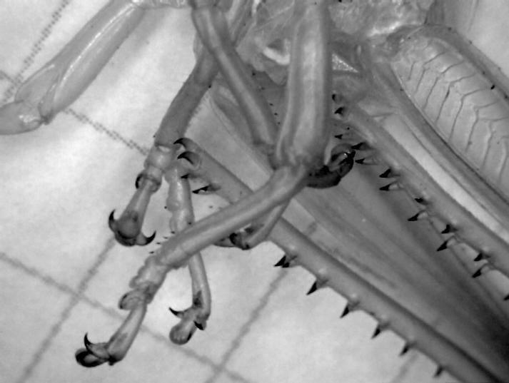
- Crowns - Shit Bra..... That is one
hell set of choppers. Good
capture.
- Helicoils - Would have preffered it
a touch sharper. Good punchy
shot again.
- My eye - I know it is supposed to
be monochrome, but maybe if you
coloured your iris.... Seen it done
and looks good.
- 50 cent - Strong macro. Light at
bottom left detracts.
- Claws - Nice and sharp. Not
enough contrast fo me though.
Great overall job again Bra. Tell me
about that lens!!!
Sean's Submissions
Martin's Submissions
| November 2009 Topic: Monochrome set by Martin |
| This work is by Sean Reason. It is licenced under a Creative Commons Licence |
|
| "50 Cent" |
| "light me" |
| "Crowns " |
| "My eye" |
Overall with weighting 8.43/ 10
Martin's photo notes
Bra;
Here’s my lot. Tried my best to get some variety
this month.
All images cropped, de saturated and levels.
Got to love that nipple…….
NFFFFQSI
Bra;
Here’s my lot. Tried my best to get some variety
this month.
All images cropped, de saturated and levels.
Got to love that nipple…….
NFFFFQSI
|
| "Dark Leaf" |
Sean's photo notes
Enjoyed this month - particularly because i am
now i have now come down to Micro scale! Its a
bit tricky not to get marked down this month
because of the post processing required for the
Desat :(
Claws - Desat levels Contrast
Crowns, cropped, Desat levels Contrast
Dark Leaf - Desat levels Contrast
50 Cent - Desat levels Contrast
Orchids - Desat levels Contrast
Helicoils - Desat levels Contrast
I time warp - Some filtering Desat levels Contrast
Light me - Desat levels Contrast
My eye - Cropped Desat levels Contrast
Enjoy
Hope you and the gang are well
| "I time warp" |
| "Discarded" |
| "Claws" |
Next month "Christmas"
Set by Sean
Set by Sean
| "BB" |
| "Helicoils" |
Sean's Pick - score and comments
"BB"
BB gets it for me mate, not necessarily
hands down but when I look at all the
submissions I keep coming back to it.
Although the over exposed fabric on
Bridgette's shirt does pull my eyes
from her face I still think it works
because everything else so well
exposed.
Maybe its working like a reflector panel.
Taking the shot with her looking away
also works? Good 1
Other image notes in order of merit
You would have taken this one out with
BB if there was no cropping :(
"BB"
BB gets it for me mate, not necessarily
hands down but when I look at all the
submissions I keep coming back to it.
Although the over exposed fabric on
Bridgette's shirt does pull my eyes
from her face I still think it works
because everything else so well
exposed.
Maybe its working like a reflector panel.
Taking the shot with her looking away
also works? Good 1
Other image notes in order of merit
- Steel, an interesting image with
top composition. Who would
have thought something we see
so often could offer so much
interest – send this one to a steel
supplier for marketing.
- Mother and Child, I wont
comment about the obvious – but
this one could have taken it out,
just the angle and the sharpness
lets it down for me. I love the
mirror effect – Ideas are popping
into my head as I write.
- Vaukei Jetty – perhaps the
distraction of all those lights put
me off on this one – I do like the
image but there is probably two
much DOF for my liking. If your
shooting angle was raised up
and to the left you could have
had the sign well back lit and
perhaps seen more of the moons
reflection.
- 5) Discarded also had the
makings of a top shot, perhaps
something a little more
identifiable and a bit of dodging
of the subject would have
helped. Also needed to be a bit
more sharp. Great background
though and use of light there.
- Chopper Pilot – Yep love the
action and punch in this shot –
James Bond is it! Not quite
enough detail for my liking on
you, It was lost with your contrast
adjustment. Composition is tops
though.
- Marty – Not bad although
something in the back distracts
me, I am not saying something
shouldn’t be there – but again
identifiable like the chopper
blades perhaps.
- Rider – A bit blurry and a bit to
busy – I can see what you were
trying to do with the contrast of
shades.
You would have taken this one out with
BB if there was no cropping :(
Overall with weighting 8.43/ 10
| "Mother and Child" |
| "Vaukei Jetty" |
| "Steel" |
| "Rider" |
| "Chopper Pilot" |
| "Marty" |