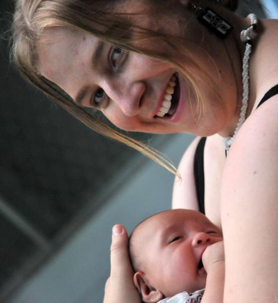
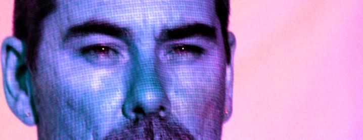
| Martin's Pick - score and comments Em Very nice indeed... Great light and contrast. I probably would have done a little burning to the shine spots on tooth, eyes and nose (and not told me about it). Image is nice and crisp with good emphasis on the eyes. It appears she is looking slightly away from the lens, could have been improved if she was staring through the sensor, or glancing obviously away. This colour is really good. I am glad you didn't monochrome it. Not that it really detracts, but I might have liked a little less depth of field to accentuate the eyes. Nailed it Bra. Print it. Other image notes in order of merit
Luv to gang with kind regards Marty. |
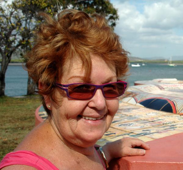
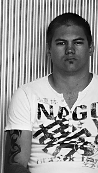
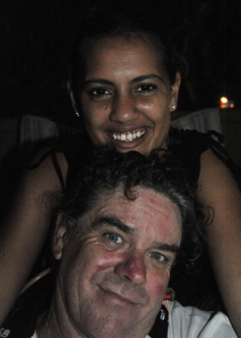
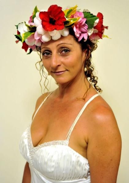
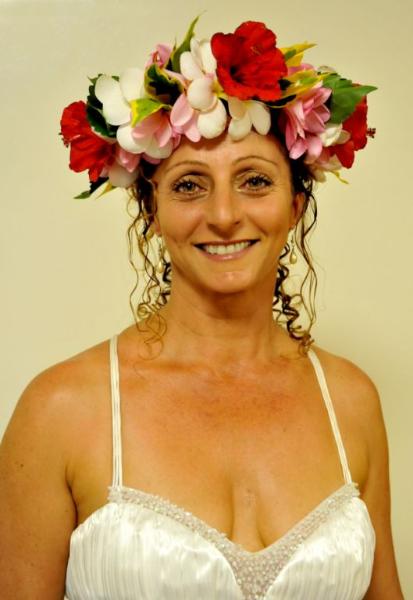
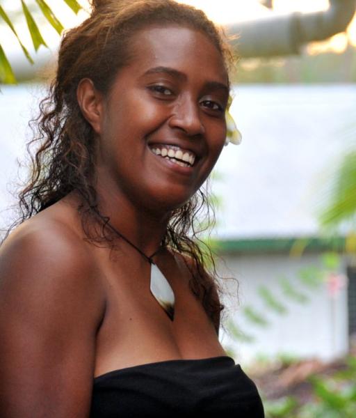
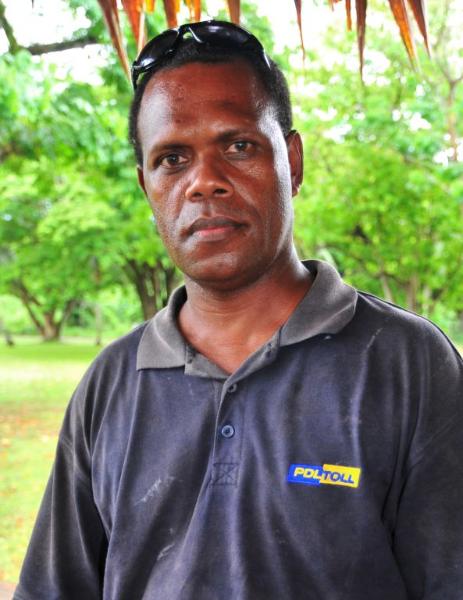
| Sean's Pick - score and comments Cathy1 Mate – I see you have had a good go at your shots this month. Out of all the shots I really think the best Portrait shot (Classic style) would be of Cathy1. You really nailed the composition and use of the neutral background works really well. It reminds me of a studio shot – & a little cleavage helps balance the eyes. With this in mind I feel you didn't need to send the other image titled just Cathy – Its in-superior to this shot. Jammie: This is my second pick. The way in which he is leaning to one side with the sunglasses on his head with the relief of the natural background sort of sums up his demeanour as a person at his work. And I guess therefore you have successfully nailed this shot. When you compare this to the photo of George – a much different impression is imparted. Ok other image notes
Keep up the good work mate, it looks like you are surrounded by lovely people which is great. Love to the gang bras. |
Sean's Submissions
Martin's Submissions
Overall with weighting 7.93 / 10
| September 2009 Topic: Portrait set by Martin |
| This work is by Sean Reason. It is licenced under a Creative Commons Licence |
|
| "Mum" |
| "My Beacon" |
| "Geoff contoured " |
| "Ryno" |
Overall with weighting 7.93/ 10
| Martin's photo notes Here’s my load for ya. Some notes: 1) Carla and Laurie – Cropped, colours, noise reduction, teeth whitened 2) Cathy – Colours, teeth and eyes whitened, wrinkles slightly smoothed, some cloning to background 3) Cathy1 – Colours and levels, shines burned, eyes whitened 4) Eva – Desaturated and softened 5) George1 – Desaturated, cropped, shines burned 6) Helen Henk and Alison – Levels, desaturated, cropped 7) Jammie – Cropped, desaturated 8) Jaylah – cropped 9) Libby and Lizzie – Cropped, levels, teeth whitened 11) Libby and William – Cropped I hope that lot will keep you going for a while…… Stay famous!! |
|
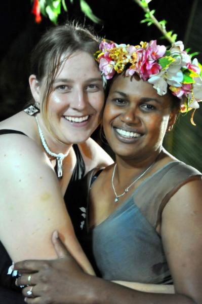
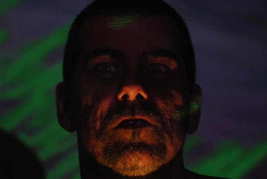
| "Em" |
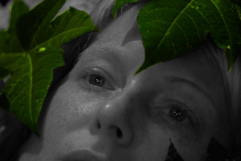
| Sean's photo notes Have been thinking about this month more than usual - probably due to the arse ripping you gave me. 1) Natures Angel: Cropped - Colour adjustment 2) My Beacon: Image rotation - slight dodge to face 3) Mum: Crop and dodge to glasses 4) Heres Geoffery: Blur to background to remove noise only 5) Geoff contoured: Crop and colour adjustment 6)Em: Cropped and obvious colour adjustment 7) Ryno: Cropped - desat - levels 8) Top visitors: level adjust Hope you and the family are going great. Best regards |
| "Nature's Angel" |
| "Heres Geoffery" |
| "Cathy" |
| "Jammie" |
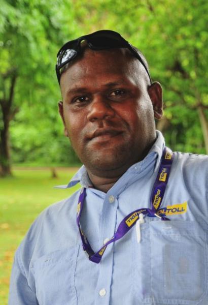
| "George1" |
| "Libby& William" |
Next month "Open Creative"
This means that your free of
constraints and I want to see some
experimentation under a creative
umbrella!
This means that your free of
constraints and I want to see some
experimentation under a creative
umbrella!
| "Eva" |
| "Cathy1" |
| "Carla & Laurie" |
| "Libby & Lizzie" |
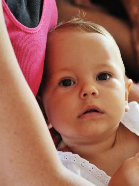
| "Jaylah" |