

| September 2011 Topic: "Best shots of the month" Set by Martin |
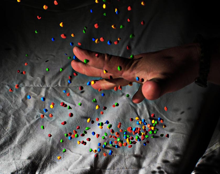
| "Antigravity" |
| "Cheesy Moon" |
| "Sophie's Bunny" |
|
| NEXT MONTH: repeating photo comp subjects from 4 years ago! Subject "Long Exposure" |
| "Amputee" |
Overall with weighting 8.35 / 10
| "I Quit!" |
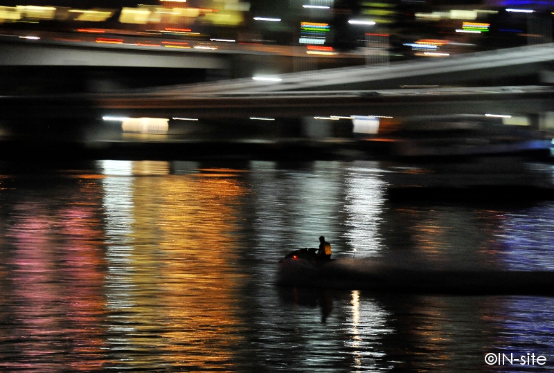
| "City of Lights" |
Martin's Pick - score and comments: "Antigravity"
Two absolute standouts for me this month. This is the third time I have changed this eval form..... I had to draw the
line on the shot that packed the most WOW, so this month the grammy goes to Anti gravity. I can see many
good points about this shot, but I will call on but two - The lighting is terrific. The angle appears to be perfect to
get those little suckers to pop right out at you. White balance looks good also (flash?) This shot has appeal to
viewers and shooters alike - shooters will likely try to emulate, but most importantly viewers will say "Gee that's
different, nice, unusual"... I really think it would be remiss of me not to mention a couple things that could have
improved this shot - bottom right is drawing my eye, and the crop at top worries me a little with some bits cut in
half.... I would have cloned em out to clean the shot up. Job well done.
Other shots in order of merit:
Two great shots!! Salute!!
Two absolute standouts for me this month. This is the third time I have changed this eval form..... I had to draw the
line on the shot that packed the most WOW, so this month the grammy goes to Anti gravity. I can see many
good points about this shot, but I will call on but two - The lighting is terrific. The angle appears to be perfect to
get those little suckers to pop right out at you. White balance looks good also (flash?) This shot has appeal to
viewers and shooters alike - shooters will likely try to emulate, but most importantly viewers will say "Gee that's
different, nice, unusual"... I really think it would be remiss of me not to mention a couple things that could have
improved this shot - bottom right is drawing my eye, and the crop at top worries me a little with some bits cut in
half.... I would have cloned em out to clean the shot up. Job well done.
Other shots in order of merit:
- CurledUp - Simple, basic, perfect capture. This was obviously the cause of my eval dilemma. Print, hang.
- Jump - Just a bloody interesting shot. Desat looks good.
- Dignity - Nice macro. Good relief. Matt Karma would be proud.... But he would have nailed you for the little
bit of shiiiiite on upper right edge of frame.
- I Quit - Love the idea, not sure of the execution. I guess it's the little imperfections in the shadow that lets it
down - bump on head and funny shaped left hand.
- Cheesy Moon - Dunno Braaaz. Just not sharp enough for me. Maybe the low res I am viewing..... Colour
looks OK.
- Brains - Good use of light. Thats all.
Two great shots!! Salute!!
| "Dignity" |
| "Brains" |
| "Handout" |

Sean's photo notes:
Hi Mate, first as usual.
Thanks for the mid-month subject
change from “Dignity” to “best shots of
the month” although I had grabbed two
shots under the first subject I included
them in here all the same..
Ok photo notes:
Hi Mate, first as usual.
Thanks for the mid-month subject
change from “Dignity” to “best shots of
the month” although I had grabbed two
shots under the first subject I included
them in here all the same..
Ok photo notes:
- Dignity: cropped, sharpened
- I Quit: (the other dignity shot
- Cheesy Moon: Crop only – bush
fire smoke coloured moon (True)
- Curled up: – Crop, Desat,
vignetted, contrast
- Anti gravity: – 8000sec with help
of SB900, crop, brightness
contrast,
- Brains: - yellow gel SB900 –
Crop, contrast, levels
- Jump: - Cropped, desat a little,
_________________________________________________________________________________________________________
| "Festival Director" |
|
Overall with weighting 8.40 / 10
Sean's Pick - score and comments: "City of lights"
City of lights, This shot reminds me of this old image I recall almost instantly, this is great work here mate,
not sure what the red plume is down on the left but the rebound laser show you have put on here is unreal.
I hope you cleared this with ground control?
Other shots in order of merit
City of lights, This shot reminds me of this old image I recall almost instantly, this is great work here mate,
not sure what the red plume is down on the left but the rebound laser show you have put on here is unreal.
I hope you cleared this with ground control?
Other shots in order of merit
- Festival Director, this is my second selection. I love the balance in this image between a number
of things that come together and just work. Good 1.
- Night Raider, Perhaps its in the name – Perhaps its in the Pan – no I reckon its the city overpasses
moving in the background and a well composed shot in the end that demands to be noticed! This is
a sleek shot perhaps only enhanced with some “Batman” like addons in post needed?
- Trim, - a very well exposed image with nice focus where it matters. Perhaps feels a little staged &
background a little out of place. Good colour and contrast.
- Sophie’s Bunny, Again spot on exposure, a little stagey but good DOF, Rabbit looks unimpressed.
Good attention on Sophie and good focus.
- Amputee, - I must say I cringed when I opened this image then chuckled in relief.. Classic comical
intent well rounded in seriousness. Distracting little red tape not that bad.. Shit stain grin not so
impressive either...LOL
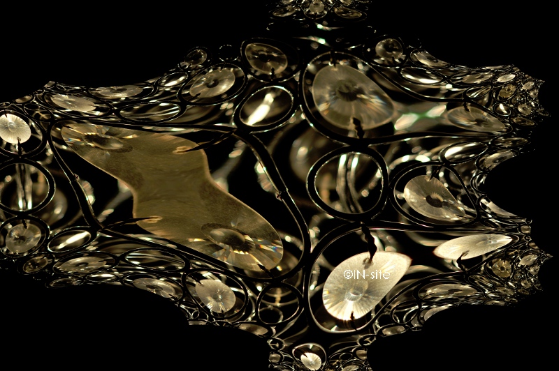
- Fractal, I have come back to this shot a number of times – not sure what it is when I come and go
but here it goes.. ... ... ? Not badly exposed all the same
- Q1, A bit overly saturated for my liking –but cool all the same, the long shutter has really smoothed
that water out too – looks a bit ominous..
Martin's photo notes:
OK Braaaaz. First as
usual.
One thing I realised with
a free topic is that I was’
nt hunting for shots. This
made me a little lazy.
Some image notes:
OK Braaaaz. First as
usual.
One thing I realised with
a free topic is that I was’
nt hunting for shots. This
made me a little lazy.
Some image notes:
- Festival Director
– Heavy crop,
levels
- Trim – Crop
- City of Lights –
Crop, colours,
contrast
- Fractal – This is a
funky light fixture,
Fractal Trace Filter
only applied
- Night Raider –
Crop, curves
- Amputee – crop
- Sophie’s Bunny –
crop
- Q1 – HDR, crop,
cranes cloned out,
curves
_________________________________________________________________________________________________________

| "Curled Up" |
| "Jump!" |


| "Desired" |


_________________________________________________________________________________________________________

| "Q1" |
| "Trim" |
| "Night Raider" |
| "Fractal" |


_________________________________________________________________________________________________________